Works

Kitchen-Sink Painting. 1942-58

View Works

Derrick Greaves first came to prominence in the mid 1950s as a "Kitchen-sink" painter. However, from the outset, the 'Kitchen-Sink' painters or 'Beaux Arts Quartet', as Derrick Greaves, John Bratby, Edward Middleditch and Jack Smith were also known, were grouped by expediency, not ideology. True, they studied at the Royal College and exhibited at the Beaux Arts Gallery, but there was no shared aesthetic or common manifesto.

As stated by Helen Lessore in 1951: "It should be stressed that they themselves never had any intention of forming a group, nor of inscribing themselves under any particular faction The more one studies these four young painters, the more different they appear. One has to take the trouble to appreciate individuals individually. Short cuts by classification are superficial".

If they shared anything then it was a suspicion of elegance and a dismissal of Henry Tonks and Randolph Schwabe's legacy of polished drawing that had taken root at the Slade School of Fine Art. Instead, their aesthetic was tougher and more robust, exemplified by their preference for charcoal rather than pencil to give a greater forthrightness and engagement: 'We were all discontented, kicking against the pricks. The bit was too tight on the drawing. We wanted to be free.the exception of John Bratby, whom Greaves barely knew and seldom met, there were bonds of personal friendship. From 1949-52, Greaves lived in Earls Court at 44 Pembroke Road, a house that had belonged to Aubrey Beardsley's mother, with friends from Sheffield including the painters Jack Smith and Leslie Duxbury as well as the sculptor George Fullard. This was extremely enterprising: since the building had been bombed, Greaves and his fellow students were able to secure a long lease on condition that they restored the property. One of his most powerful early paintings, Baby in Pram (1949) showed Duxbury's child on the doorstep and a portrait of Jack Smith (c.1949) was also painted there.

Jack Smith had been a friend since childhood when both lived on the same Sheffield street and shared a love of painting and drawing. Then, when both men went to live and study in London, it was natural that they should share digs together. Greaves recalls that Jack Smith had the large back room at Pembroke Road, overlooking the garden, and worked so conscientiously that soon the room was so filled with paintings on board that Smith could barely get to his table to eat. It was a fun and stimulating time. Greaves was particularly close to George Fullard whom he recalls as very bright, rather wild and with a lightning mind. He was full of songs and jokes and for entertainment on a Friday and Saturday evening Greaves and Fullard would go down the street to the Pembroke Arms pub and sing music hall songs such as Me and Jane in the Plane, The Winkle Song and Me and Old Bill Smith were Dusties.


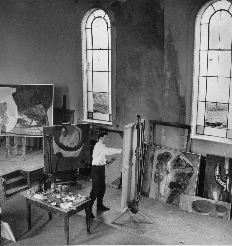
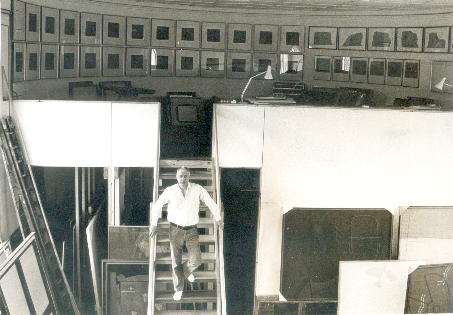
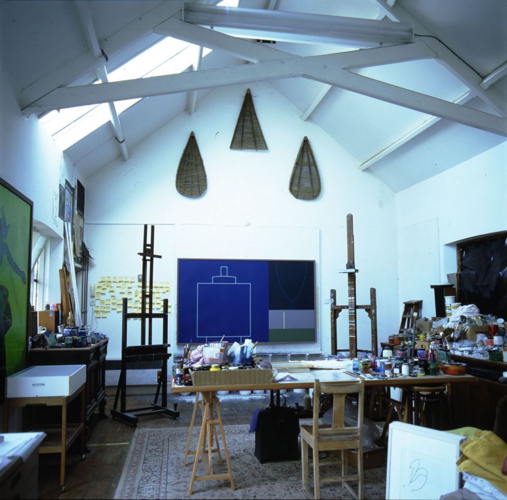
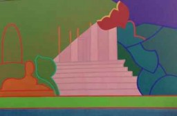
[Fawcett Yard Studio Interior]

Around the corner was Edward Middleditch's studio and his close friendship with Greaves dates from this time. They would see each other's work as it progressed, talk intensively about their interests and read many of the same authors, among them Jean-Jacques Rousseau, D.H. Lawrence and Aldous Huxley. Dissatisfied with the work of many of their contemporaries, they sought an art that was tougher and more straightforward. This led them to reject Paris, or at least its younger artists, whom they felt to be imitating the mannerisms of their elders. But their conversation was above all practical rather then theoretical; for example, conversations about paint and colour might turn to their preference for Rembrandt colours, which had a greater range than was offered by the more familiar Windsor and Rowney.

Where Middleditch and Greaves differed was in their response to landscape, a dominant concern for both artists, neither of whom dwelt on city motifs. Greaves loved the romantic idea of the northern landscape, running through Wordsworth's Cumbria to W.H. Auden's idea that you can put your ear to the ground and hear water in unseen conduits. In contrast, Middleditch responded to the landscape in more visual terms, not least through his friendship with some of David Bomberg's former students who dramatised the bulk of the landscape and the drama of a slope.

Above all, there was a generosity of spirit, a camaraderie in which these artists were more inclined to praise than criticise. What mattered was to do the work. Touting the work around galleries was anathema and the idea that it might sell a distant thought. If there was a 'Kitchen-Sink' group then it was this band of artists living together from 1949-52 in a house of bed-sitters with a shared sink in the kitchen downstairs. This was a period that predated their first one person shows and coincided with their student years, and it is conspicuous how little this circle of artists ever had to do with John Bratby. What's more, by the time that 'Kitchen-Sink' painting was championed Greaves was not even living in Britain, having won a scholarship to study for a year at the British School in Rome (1952-3), which he then succeeded in extending for a further year (1953-4).

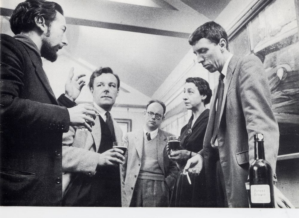
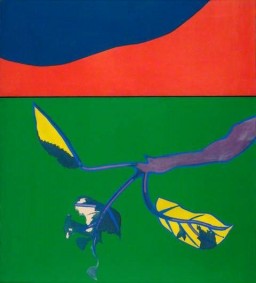
[Jack Smith, Edward Middleditch, John Bratby, Helen Lessore and Derrick Greaves 1956]

In fact, the critical promotion of a 'Kitchen-Sink' school developed during the mid rather than the early 1950s. In late 1953, the Walker Gallery in London staged an exhibition entitled Paintings for the Kitchen. Just as John Berger presented young social realists as a continuation of tradition, so the anonymous reviewer of this exhibition in Art News and Review provided an historical foundation: the kitchen has a hallowed place in the history of art ... The marmites of Chardin, the flayed chickens of Soutine, the eggs and frying pans of William Scott, are all part and parcel of the great mythology of European art.year later, David Sylvester wrote an essay entitled 'The Kitchen-Sink' for the recently launched journal, Encounter. This, too, provided an historical context for the paintings of a new generation of artists and again addressed painters from across Europe. Sylvester's essay was extremely broad in its historical and geographical references. It used 'Kitchen-Sink' as a characterisation, not as a label, to trace a broad international trend rather than denoting a small British group and did so without making claims for the realism of these painters. Indeed, the very idea that 'Kitchen-Sink' painting constituted realism was anathema to Sylvester, whose own existentialist 'realism of the imagination', exemplified by Francis Bacon and Alberto Giacometti, stood in opposition to the 'Romanticism' that he deplored in artists such as Paul Rebeyrolle. However, the label 'Kitchen-Sink' stuck and was subsequently applied to just four artists - Bratby, Greaves, Middleditch and Smith - at the centre of claims for a British social realism and Sylvester became credited with giving the quartet its name.

Despite Sylvester's perceived association with the idea of 'Kitchen-Sink' painting, the presentation of a quartet owed more to other writers, not least to John Berger, John Minton and Helen Lessore of the Beaux Arts Gallery. Lessore not only staged the first solo shows for the painters but also arranged their first group show, at Cambridge's Heffer Gallery in 1955, which encouraged critics to seek points in common in what became known as the Beaux Arts Quartet. Their profile helped Lessore's gallery assume a coherent identity and it quickly became synonymous with social realism by young artists. In 1953 John Berger asserted that 'The Beaux Arts is quickly and deservedly gaining the reputation of being the one gallery where it is possible to see the serious work of young painters'; in 1956 Quentin Bell observed that 'the Beaux Arts Gallery ... is in a sense the spiritual home of social realism in this country' and, in 1957, Trewin Copplestone described the gallery as the 'group Headquarters' for the Kitchen-Sink painters.

In fact it was not until the 1955 exhibition of the Beaux Arts Quartet at Heffer Gallery, followed a year later by the Venice Biennale, that Bratby, Greaves, Middleditch and Smith were exhibited together as a group. In each case, however, the stress was placed on the individuality of each artist. Indeed, despite the desire to champion a common project, John Berger was sophisticated in the way in which his first reviews of the Beaux Arts Quartet not only placed the work of each artist in a wider national and international context but also acknowledged individual achievement. In a review of Bratby's first solo show at the Beaux Arts in 1954, Berger contextualised the 25 paintings on show, writing that 'Bratby's vision has values and qualities in common with Jack Smith, Edward Middleditch and Derrick Greaves. There is the same suspicion of elegance and the same ability to be moved by the commonplace'. However, he did also acknowledge its 'intense and personal emotions'.

Certainly, Berger made generalisations about the social implications of the quartet's choice of subjects, but nevertheless he was careful to distinguish between intention and implication. Recognising that 'the motives are not directly social or political', Berger argued that 'they all paint without protest but with great sympathy for the few precious possessions of the dispossessed'. The consistency he perceived in their subject matter encouraged Berger to believe that the quartet did not simply present what was in front of them but had a conception of what was an 'appropriate' subject.

A prevalent theme was that of a mother and baby. Reflecting both personal circumstances and a post-war baby-boom, these prosaic images were nonetheless an antidote to Henry Moore's lofty idealisation of the subject as a universal symbol of maternity. Edward Middleditch's rare depiction of a person, Baby (1952), Jack Smith's iconic Mother Bathing a Child (1954) and Greaves's First Steps (1956) are paintings of privation conveyed in muted tones that are at best distantly related to Moore's well-fed families. Greaves had married a nurse, Margaret Johnson in 1950 and in 1956 she gave birth to their first child, Simon, soon to be followed by Julia and Daniel. Images of his wife and oldest son would dominate his work of 1956 and its presentation in exhibitions in London that year.

However, critics were quick to recognise the fissure between critical aspiration and artistic practice, which was growing ever wider as the work of the individual members of the Beaux Arts Quartet became more subjective, hermetic, romantic and even abstract. Their former tutor at the Royal College, John Minton, who perhaps felt that their fame was eclipsing his own, satirised this in an essay of 1956 entitled 'Three Young Contemporaries'. Referring to 'three of the most notable painters who have left the Royal College in recent years', namely Greaves, Middleditch and Smith, to whom he referred by initials only, Minton ridiculed the gap between the lofty aspirations of the critic and the pragmatic concerns of the artist:

No painter wears his heart on his sleeve and no painter explains himself except by his painting. Set a questionnaire he will do everything to lose it ... Is that the ageless Venice, Mr. G? Are you a social realist, Mr. M? Is that the Child of Europe, Mr. S? ... Is it valid? Does it relate? Is it socially significant? The critics cry and in answering themselves fill their columns. Giving the painter time to get the nose drawn right, the foot reshaped, the foreground redrawn, the middle-distance reconsidered. Yes, but isn't it too descriptive? Or not descriptive enough? Or too theatrical? No, but I mean, is it timeless? And the painter has time to buy more paints, to catch the train, even for a short delay in the station bar, and he is away...

Elsewhere their individuality was celebrated. One of the leading British art journals, Art News and Review, published a front page profile on Derrick Greaves in November 1956 that not only confirmed how quickly his reputation had become established but also provided one of the most prescient characterisations of his concerns. In it the art critic Pierre Rouve wrote that:
attachment to whatever the devalued term 'realism' may mean is all too often a shield for creative impotence. With Derrick Greaves it is above all an act of humility. It is the refusal of a man deeply immersed in the vicissitudes of the human adventure to transform his art into some kind of shop window for the wares of egocentric fetishism.

By now Greaves was routinely included in London's institutional and commercial galleries. His first significant exposure had come in group exhibitions of young painters at the Lisle Street gallery of the Left-leaning exhibiting society, the Artists International Association (A.I.A.) in 1949 and 1950; at the R.B.A. Galleries in 1950, where he showed Deal Beach (1949) ; and then at the Whitechapel Art Gallery in the seminal group exhibition of social realism, Looking Forward (1952). From such exhibitions Greaves received his first attention from the press.

The most important of these exhibitions was Looking Forward, a manifesto exhibition of social realism curated by John Berger, which was explicitly conceived to attract a large public audience and to be accessible to the working class. As Berger wrote, the exhibition was intended to provide 'the raw material of a socialist art' for which 'the new patrons will be trade unions, democratic local councils, community centres, etc.' The catalogue provided a bold characterisation of Berger's realism:
Realism is not a method but an attitude of mind ... the realist always starts from the particular and from this beginning tries to deduce a typical truth ... the realist is fundamentally optimistic because he accepts the world - not necessarily as it is - but as it can be, according to the potentiality of its own laws of development ... The realist attitude breaks down the studio wall and projects the artist into ordinary life.

The materiality of the thick paint married to social concerns led Greaves and several of his contemporaries to be presented by critics as followers of Gustave Courbet, especially in the wake of a major exhibition of the artist at the Marlborough Gallery in 1953. Prominent among these champions were John Berger and Nevile Wallis. In his review of Berger's exhibition, Looking Forward, Wallis singled out for praise Arthur Hackney, Edward Middleditch and Derrick Greaves, whom he characterised as 'Cousins of Courbet'. This relationship was also at the heart of Berger's praise of artists as individual as Prunella Clough and Josef Herman.

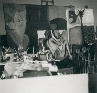
Following Looking Forward, Greaves's public career took off, although characteristically the artist was diffident about this success. In 1953 he had the first of his two solo exhibitions at Helen Lessore's Beaux Arts Gallery. In contrast to Michael Andrews, for whom the gap between being offered a show by Helen Lessore and its realisation was six years, Greaves had just three weeks between Lessore's visit to his studio and the staging of his first show at her gallery. Greaves recalls that she visited twice, explaining that she never decided after a single studio visit: 'then to my terrible surprise she said can you be ready in three weeks? So I showed what I had.' This included canvases he had rolled up and brought back from Rome and recent works of Sheffield. But Greaves never saw the show, having by then travelled back to Italy for the second year of his Abbey Major scholarship in Rome.

Greaves sold everything at his first one person show at the Beaux Arts Gallery. As the artist later recalled:
I was surprised but not amazed at the success, but I was just getting on with things in Italy John Berger wrote about me regularly after that, but it was as though it was happening to somebody else. It's journalism. All painters know what the value of their paintings are. The fact that they may be used to justify this, that and the other is not to do with them really. I felt that you couldn't ever really expect to make a living out of painting and didn't really want to court the publicity. I didn't really know what to do with it. Bratby wanted us to be known as a group, but the rest of us felt the job was to be an individual. Be responsible for your own thing. It all happened in parallel to what I was doing.

Greaves's exhibition attracted enthusiastic support. Stephen Bone, writing in the Manchester Guardian, proclaimed that this was 'one of the most promising first exhibitions that has been seen in London for some time', praising 'a strong and individual personality'. John Russell, meanwhile, declared in the Sunday Times that the exhibition, 'with its ease and natural breadth of manner, foretells a distinguished career'.

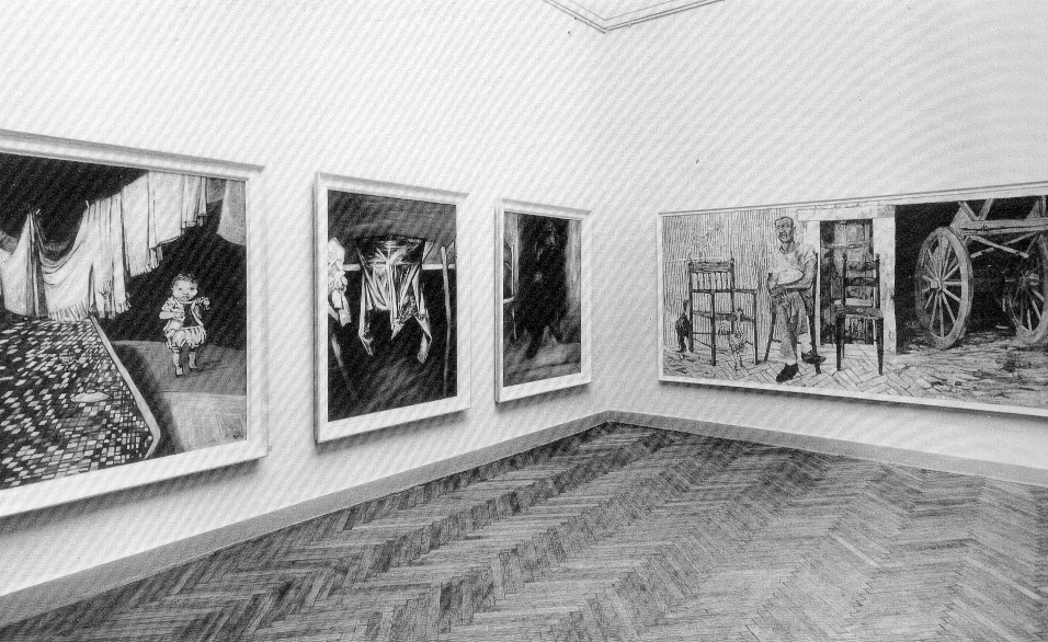
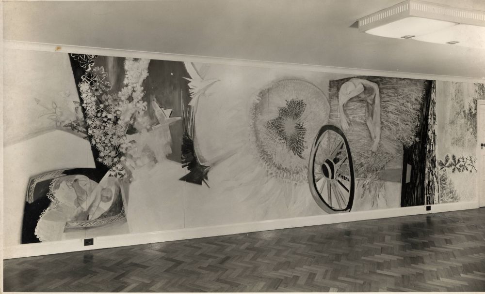
Then, from November to December 1955, Greaves held his second show at the Beaux Arts, this time coinciding with Sheila Fell's first exhibition at the gallery. Given the large size of the paintings just eight were shown, accompanied by a portfolio of drawings. Some of his most ambitious paintings, these works were nonetheless attacked in The Times for an 'obsessive concern with detail at the expense - particularly in some large work - of an interrelated design'. This was criticism that John Berger directly refuted in a lengthy paean of praise: 'The privilege - and I mean that in all modesty - of describing these works for the first time presents formidable difficulties; their originality, which manifests itself not in their novelty but in their profound obviousness, excludes all ready references.' What Berger identified and stressed was a literal, mimetic quality, a direct relationship between Greaves's handling of paint and the quality of the thing depicted: from the smoothness of a baby's skin to the roughness of a worker's hands. Arguing that 'Greaves has rejected every precept of academic teaching', Berger praised the way that 'the arbitrariness of any one moment of life comes before the imposed pattern of any composition'. Hence the fact that the largest painting on show, Cart and Peasant, eschews a conventional composition and gives each object its own autonomy and individuality, not so much a breakdown of the composition as a way of showing respect for each distinct element: 'Indeed each object is separate. If a man has only ten possessions, he tends to count them separately.' This separation, already identified in this review of 1955, would be a central aspect of Greaves's presentation of objects in the decades to come.

Inclusion in group exhibitions consolidated Greaves's reputation and status as a leading realist. In 1955, he was included in The Artist's View of an Industry which laid stress on the work of young artists who were invited by Shell Oil to make works on the subject of the oil industry. Greaves and Middleditch each produced pictures of a distillation unit at Shell Haven refinery in Essex, suggesting that the two friends had made a joint visit. Then, the following year, Greaves was one of the younger exhibitors in the Institute of Contemporary Arts (I.C.A.) exhibition of landscape painting (January 1956) and included in the Arts Council's Six Young Painters (1957), which presented figurative paintings by John Bratby, Michael Andrews, Cohen, Martin Froy and Philip Sutton. Internationally Greaves also appeared in major exhibitions in Russia and Italy. Then, at the year's end and coinciding with Rouve's aforementioned profile, Greaves had work included in exhibitions at the Adams Gallery and the Piccadilly Gallery, both in London.
By now drawings and paintings of mother and child had become a key theme for the artist and were brilliantly evoked in an essay by John Berger on the Kitchen-Sink painters that reproduced Greaves's painting, Sleeping Mother and Child (1956):When he paints the hand of a mother holding her child, he tries to suggest all that has made that hand what it is. The cooking, the sewing, the caressing, the clenching in anger, the scrubbing, the way it's been held by her lovers. And then he contrasts all this with the baby's hand - the baby who is just beginning to learn through his hands to distinguish one object from another.

In precise working drawings of the mid 1950s the form would be carried by line alone, as in Baby - Finger in Mouth (1956) , the sparseness of which anticipates the use of line in Greaves's later work. Greaves would convey his tenderness towards the subject, as in Mother and Child (c.1956) by using soft pencil, but he would also make robust pencil and charcoal drawings, such as Baby, Bath and Dog (1956) for exhibition. The paintings of his children that resulted, such as First Steps (1956), Simon Martin Greaves (1958) and Anna Julia Greaves (1958), used paint in a post-Cézanne way, with colours mixed on a palette or plate dabbed on a bit at a time. First Steps is characteristic of the period, although its delicacy contrasts with contemporaneous, thickly impasto paintings in which forms were painted to suggest the weight of the subject and light used to model their volumes. First Steps was included in one of the most important international exhibitions of British art of the 1950s, Looking at People.


Looking at People toured Britain during 1955-6 and was visited by 250,000 people before travelling to Russia where it was the first show of Western art since the Russian Revolution in 1917. Initially including work by just three artists - its instigator, the illustrator Paul Hogarth, the painter Carel Weight and sculptor Betty Rae - by the time it reached its final British venue, the South London Art Gallery, Looking at People had been expanded with the inclusion of Greaves as well as Edward Ardizzone, Alistair Grant, George Fullard and Ruskin Spear. It was this expanded version of the show that travelled to Russia and was at that time one of the largest exhibitions of contemporary British art ever held outside Britain: the catalogue lists 156 works.


Spear, Hogarth and Greaves travelled to Russia for the exhibition, cutting the tape at the opening at the Pushkin Museum of Fine Arts and speaking on Moscow Radio. In a speech at the opening ceremony, Hogarth told of the idealism behind the show: 'We have been moved by the fact that artists as well as statesmen can and are able to contribute to international understanding.' But this exhibition of British social realism received only limited support and its proposed exhibition at a second venue, the Hermitage, was cancelled.


Whilst there, Greaves also travelled through the Soviet Union under the auspices of the Union of Soviet Artists, meeting artists in each town, and visiting studios and workshops where he was able to talk freely with the artists. He also travelled to Armenia and produced a series of large monoprints which he later showed in London.


He found Soviet art to be figuratively competent to the point of slickness, but very worn and out-of-date by that time. Ilya Repin, for example, he disliked for his rhetoric, whilst recognising his confident proficiency. What he did admire were Russian icons and Andrei Roublyov's 2ft-high (61cm) figures, the memory of which has stayed with him ever since, while, in the Hermitage, works by Picasso, Matisse and Raoul Dufy made a lasting impression. Little was to be seen of modern Russian art as it was kept hidden away in the basement storage areas of the Tretyakov Gallery and other museums. This was frustrating to Greaves for he had hoped to see work from Marc Chagall's Vitebsk and paintings by Kasimir Malevich and Natalia Goncharova, but none was to be seen.

At the end of 1956, the impression of a social realist context for Greaves's painting was reinforced by two extremely focused group shows at the Adams Gallery and the Piccadilly Gallery. Three British Painters at the Adams Gallery presented just Greaves, Middleditch and Peter de Francia. All but two of Greaves's paintings were studies of a baby and the others were of a pregnant woman, and 'owe their immediacy of feeling to a realist's true concern for the dignity and pathos of the human condition'.24 For Alan Clutton-Brock, reviewing the exhibition in the Listener, Greaves's 'series of pictures of babies show an advance in vigour and precision of statement; the best of these works have an undeniable if alarming vitality'. For John Golding 'the exhibition ... makes one aware of the extent to which the new English realism is becoming a conscious school ... all [three] take the same blunt, rather grim view of life, and all work on a large-scale in a direct and uncompromising technique'.

At Christmas 1956, the Piccadilly Gallery showed drawings by three artists: Greaves, Middleditch and Alistair Grant. This time Greaves presented no less than 14 drawings on the theme of maternity, gaining an ecstatic review from one of the leading critics of the day, Pierre Rouve:


This is drawing almost at its very best - an art that does not aim at black and white substitutes for luscious pigments and relies on a concision of line and candour of emotion. Here the draughtsman is what he should always be - a truth teller With an impressive economy of means and with a vigilant eye for the basic impact of his graphical idiom he avoids the twin traps of academic verisimilitude and expressionist rhetoric. Through the elimination of the superfluous he achieves that overwhelming immediacy without which drawings lose their autonomy to become mere stand-ins for a painting to come. With Greaves, drawings are stars in their own right - for his art, bred on simple integrity becomes more and more a decisive denial of artfulness.


The immediacy and clarity that Greaves now demonstrated as both painter and draughtsman owed much to what he had learnt in Italy.
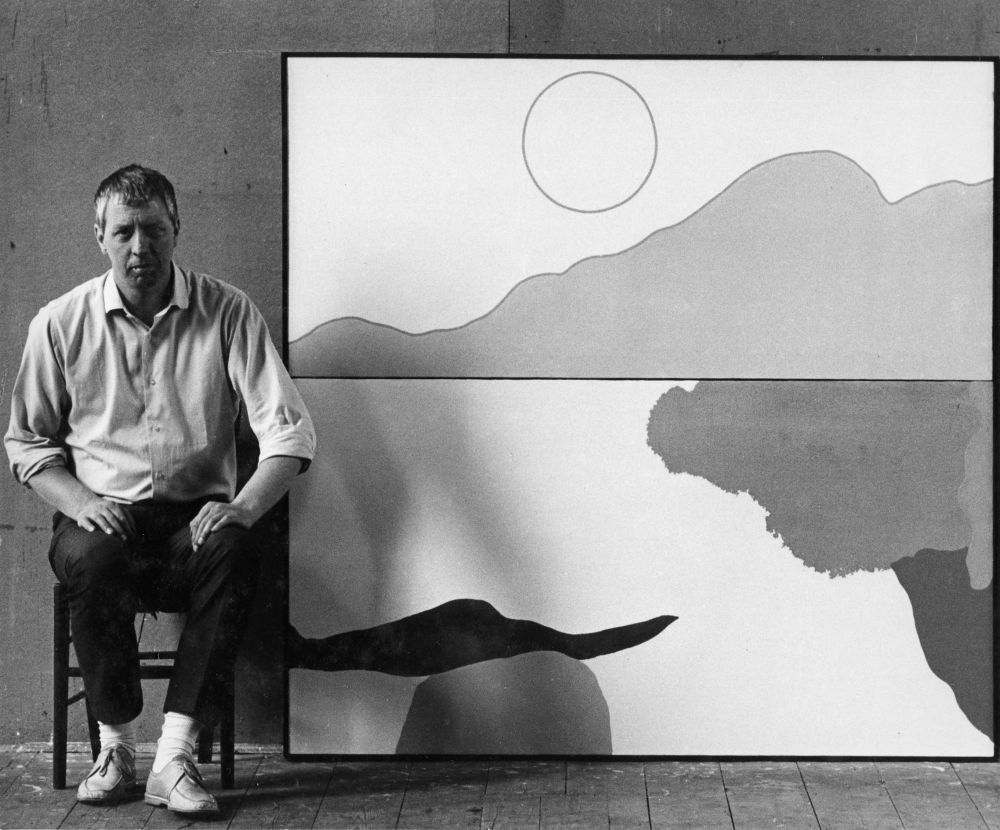
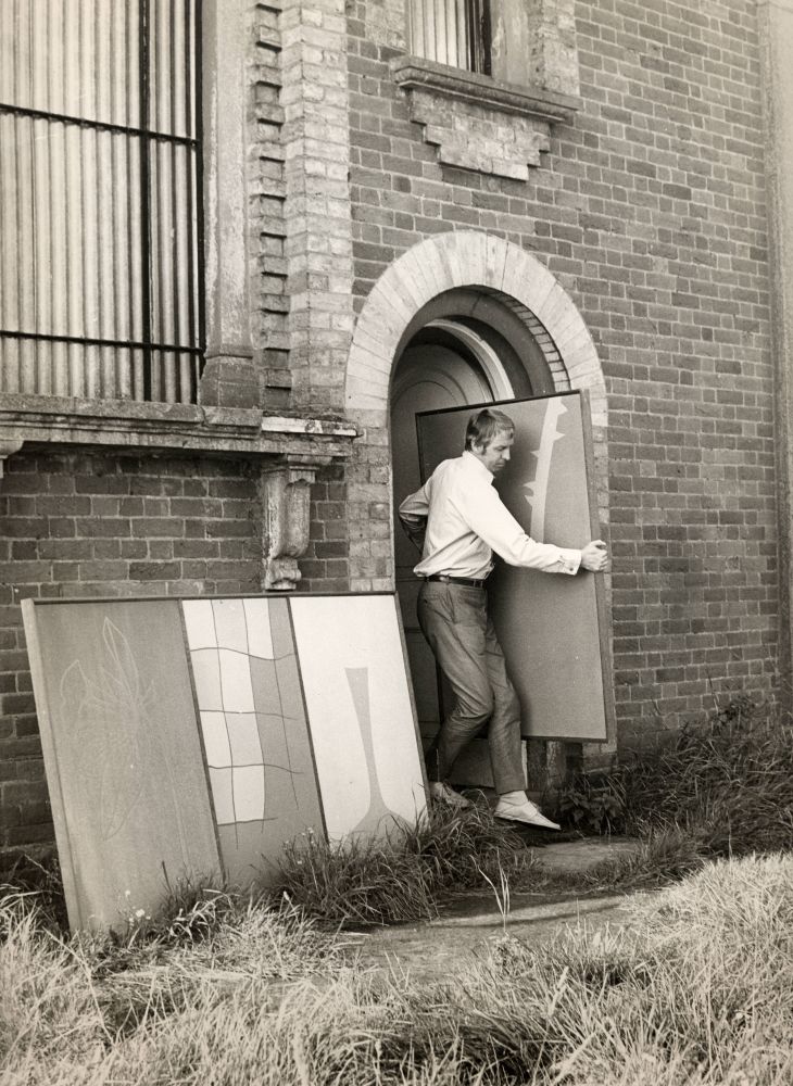
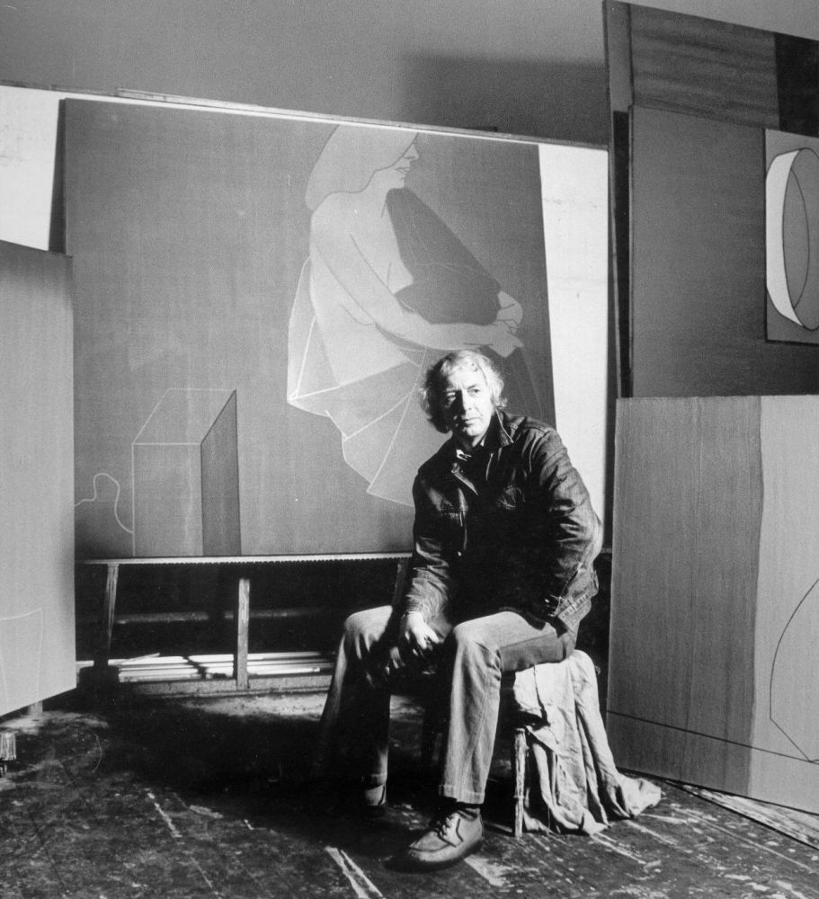
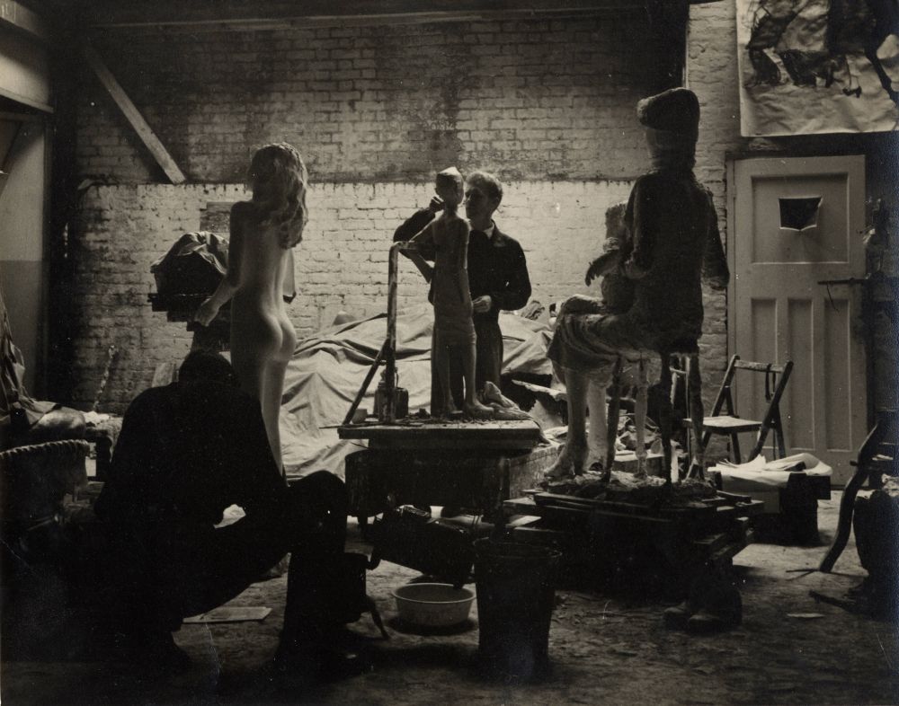
Italy. Mid 1950s

View Works

The two years that Greaves spent in Rome from 1952-4 were seminal for the development of his work. They may not have represented a break from the past but were certainly a great leap forward. Greaves had travelled to Italy for the first year of his Abbey Major scholarship clutching a folio of drawings that included studies for The Waiting Room and for other allegorical, angst-ridden pictures. These were soon replaced by works inspired by blue skies and sunshine, and the impact of good food and wine and beautiful frescos.

They were 'replaced' literally, for as Rome grew chilly, Greaves burned the drawings he had brought from London in the studio stove to keep warm. This would be the first of the many therapeutic bonfires of rejected works that have punctuated key moments in the artist's career.

The journey to Rome, via Paris, with his wife proved to be stressful for Greaves, but when he did finally arrive by train at Turin, gone midnight, and found a restaurant, he relaxed immediately and felt completely at home with Italy. They then travelled down the coast, inland through Perugia and Tuscany to Rome. After the privations of England, the food and wine made a big impression and appropriately one of Greaves's most powerful early works is a large charcoal drawing, Spaghetti Eaters (1953).


[La Romana (1953) in the painter's studio, Rome, 1953]

The visit to Italy was crucial to the painter's development, as Greaves would later recall:Painting has an almost magical quality. Sometimes it can be prophetic. It's risky and rather dangerous. It's a visual world, which can have a vivid parallel reality to your life. Like writers and poets and composers you can dissolve your ego into your own activity. There is a life in a painting, which transcends me or you. Italy changed my direction and approach.What especially impressed Greaves was the indivisibility of life and art. Art was not confined to museums and galleries. It was all around. Churches and civic buildings contained frescoes, there were mosaics on the floor and statues in the streets. He was especially struck by a visit to the Campo Santo in Pisa where the frescos were being restored and he was able to see, first hand, the pentimenti. This under-drawing, although rough, showed how even at a relatively late stage alterations were being made by the artist in response to the surface on which the fresco was being painted. He was excited by the immediacy of it all: 'When I heard that Giotto was a joker and deliberately dropped paint on apprentices below, I could imagine that, having been a sign-painter!had given him no sense of the works in their setting or their scale: 'At the Royal College I thought of painting as easel painting In Italy pictures filled whole walls: horses, dogs, figures were life size. The difference between size and scale affected me profoundly.' He also felt there to be a visual togetherness between people and place, a harmony brought about by the continuation of the past into the present. This was a quality Greaves recognised but did not himself feel in England, hence the fact that his scenes of people outdoors were almost exclusively painted in Italy.


Greaves's handling of paint was still thick, dusky and Courbet-like in the weight given to each form, but it was also increasingly straightforward and unmannered. His first Italian pictures show that he was building on what he had learnt from paintings such as The Waiting Room (1951) and Sheffield (1953), but also reveal that he was seeking to compose works in which he no longer overburdened the picture with incident as he had in The Temptation of St. Anthony (1950-1). His first large-scale Italian painting, Portovenere (1952), points the way with its bold simplification of form and flattening of space so that the lines of steps merge into the layers of brickwork of the distant church and the sky seems to possess the same materiality as the land. Then in Peasant Interior, Sicily (1953), a painting that can be read as a more sophisticated reprise of ideas first explored in The Waiting Room, Greaves depicts a humble room that is almost completely deprived of furniture and dominated by expanses of scumbled wall. There are two simple chairs, a simple table, a bowl and some plain clothing, but otherwise the room is empty. Perhaps, above all, what draws the eye is the left-hand section of the work, where a doorway is shown leading to a corridor. No people are shown and it is as though we ourselves are in the room, waiting expectantly for someone to arrive. But the existential overtones are less heavy than before - to live so simply might be a joy and not a burden, an aspiration, not a sentence. The painting also illustrates that the best of Greaves's early paintings, and indeed many of those that followed, have a stillness, a sense of quiet calm: life is simple, objects are distinct and the presentation is direct.


[Peter Branfield, Michael Andrews, Heinz Inlander and Derrick Greaves,
British School, Rome, 1953]

The painter Derek Hill was one mentor. When it was time to travel to Rome for his second year at the British School, Hill offered Greaves a lift by car to Rome. The journey included a week's stop off in Paris where Hill had a portrait commission. Paris was freezing, the hotel room was cold and it was hard to sleep with inadequate blankets. Greaves had left what little he had with his wife in England, so he couldn't even get warm with good meals. This was a melancholy time. Greaves wandered the streets and sought warmth in the museums. Once more, arrival in Italy brought renewed vigour. Through Hill, Greaves was introduced to a new social circle. Hill seemed to know everyone and he would invite the great and the good, from Anthony Blunt to Martha Graham, to the British School for dinner. In Rome, Greaves received new stimuli and made new friendships including one with the leading Italian social realist, Renato Guttuso, whose influence overlaid what he had learnt at the Royal College of Art. As Berger recognised, the result was that Greaves's work revealed a fruitful coexistence of British and Italian qualities: 'Their subject matter, their light and colour, are all Italian, their understatement and bound-in passions are very English ... Greaves is no longer promising: he is, whether recognised or not, a European artist.scale of Guttuso's paintings must have reinforced Greaves's existing interest in painting big, whilst the use of heightened colour surely encouraged his move away from a muted palette and relatively tonal approach, but the emotive, expressionist dimension of Guttuso's work repelled him. Nonetheless, their friendship is encapsulated by a party Greaves held for Guttuso and his wife on the occasion of the Italian's 1955 visit to London. The guests included George Fullard, Edward Middleditch, Leslie Duxbury and Alfred Daniels.

Greaves's own background also paralleled that of many of the Italian artists celebrated by Berger. In an essay entitled 'Italian Artists of La Colonnaand elsewhere, Berger made much of the artist having a practical function: as mentioned, Greaves had spent some time as an apprentice sign writer before entering the Royal College of Art. The artists of 'La Colonna' were also regular writers on art, and this is echoed by the contributions made by Greaves as a broadcaster and writer.


The impact of Guttuso's work on Greaves was transmitted principally via the Englishman's visits to Italy rather than the example of what he saw in exhibitions in England. It is perhaps clearest in the Mediterranean motifs presented by Greaves, such as images of leisure and work. The dry surfaces of paintings such as Anticoli Corrado, Italy (1954), Children on Steps (1956) and Sicilian Peasants Resting (1956) echo an omnipresent feature of British painting of the 1940s. However, in contrast to the nacreous surfaces of Ben Nicholson or the luminosity achieved by John Piper, Greaves's surfaces often resemble the tempera of a medieval Italian mural painting. In colour, texture and subject matter, Greaves's The Cart (c.1953) also reflects his admiration for paintings on the sides of the Italian carts used by the agricultural workers. Greaves saw such carts when he visited Guttuso's birthplace, Bagharia in Sicily, and recognised their influence on Guttuso in both their colour and presentation of narrative.


Although based at the British School in Rome, during January and February 1953 Greaves visited Venice, a stay that led to some of his most significant early paintings. Greaves was struck by the melancholy silvery light of winter as it bounced off the water of the largely deserted canals. Venice in the Rain (1953) presents a precarious gondola ride along a choppy canal, whilst in Venice (1953), the two halves of the panoramic format are perfectly in balance, the composition tightened up by the frieze-like background of the façades of the palaces alongside the canal. But, above all, it is the stones of Venice that dominate and the four people on a gondola are merely a small harmonious detail.
Greaves also drew the Piazza San Marco from the Campanile, and this provided the source for a large painting that he began in Rome and completed in London. While still unfinished in his studio in Rome, Domes of Venice (1953-4) attracted a pertinent criticism from the painter Pavel Tchelitev, who declared 'you work too much from nature', an assertion with which Greaves himself would soon concur.


Greaves also learnt much from the British visitors and students in Rome, among them Peter Lanyon, Tom Monnington and Michael Andrews. Admiring Lanyon's toughness, directness and courage, Greaves nevertheless argued with him over his response to landscape. On a walk in the Abruzzi mountains Lanyon discerned heads in dry river beds, whilst Greaves saw nothing but rocks and tree roots. The prose of Greaves's matter-of-fact approach clashed with the poetry of Lanyon's more metaphoric response. Monnington, meanwhile, admired a new painting by Greaves in his studio at the British School, praising its use of the golden section, where a rectangle is divided into two unequal but proportionate parts. It was an unconscious sense of proportions on Greaves's part, so Monnington drew diagrams to explain what he meant. This lesson would lead Greaves to re-evaluate this aspect of picture-making and to this day has had a profound impact on the structuring of his compositions. Greaves would also travel with Monnington to see the Signiorellis at Orvieto Cathedral and Piero della Francesco's Flagellation in Urbino. Meanwhile, Greaves found Michael Andrews to be a charming companion, but realised that for Andrews London held greater delights than Rome.


Italy led to a change in light and in colour. In Woman Under an Olive Tree (c.1953) there is a robustness to the woman, whose powerful body is matched by the roundness of the wine bottle she clasps and contrasts with the spiky angularity of the olive tree: a humble equivalent of one of Graham Sutherland's greatest portraits, Portrait of Somerset Maugham (1949), which was similarly inspired by the Mediterranean sun. This formal contrast between the tree and the woman would subsequently contribute to the power of one of Greaves's most significant diptychs, In The Garden (1971). Another recurrent theme, from the 1950s onwards, was dogs and their scruffy presence is evident in some of Greaves's most powerful Italian pictures, such as the Arts Council's Dog (1955) and Men and Dogs in a Landscape (1953).


Appropriately, it was the strength of Greaves's paintings of Italy that contributed to the decision to include him in the British Pavilion at the Venice Biennale of 1956, where he showed four of his Italian paintings. This was the only occasion when the four 'Kitchen-Sink' painters exhibited together outside Britain and was the crowning moment for the Beaux Arts Quartet, although it was one that Greaves once again missed, since by then he had returned to England and the British Council did not have the funds to send the artists to Venice.


Greaves recalls that Lilian Somerville, Director of the Fine Arts Department of the British Council, paid a visit to the studio that he shared with George Fullard with a distinguished group that included the eminent art critic, Herbert Read. So dusty was the studio from all the sculptor's bags of plaster that Fullard would swill it down each evening and when Herbert Read took off his hat, Greaves did not feel that it was out of deference. When asked about one of Greaves's paintings, Read declared it to be a good exhibition picture, damning it with faint praise. It would be the two men's only encounter.


As with the precedent of the recent Heffer Gallery show of the four Kitchen-Sink painters, the idea of a coherent group was undermined by the selection and installation of the pictures as well as by the catalogue. The artists were simply referred to as 'Four Young Painters' and the selection of pictures by Herbert Read highlighted each artist's differences through the choice of subject matter by which each artist was represented. It demonstrated that the Quartet were moving away from the prosaic English subjects and settings that had first gained them acclaim, in Greaves's case towards the sun, light and colour of the Mediterranean. Greaves was represented by four sunny outdoor scenes made in Italy. In Sicilian Subject (1954-5), an epic scale, extended horizontal format and emphasis on the front plane results in a clear and colourful image that recalls a wall painting. Making apparent its allegiances to Italian social realism, it presented a Mediterranean motif, employed a range of sunny yellows and included a cart, typical of the farmers of Guttuso's Sicilian homeland.


The installation of these paintings allowed each artist his own wall space whilst collectively their work provided a visual counterpart to Ivon Hitchens, the more senior painter with whom they shared the British Pavilion. Particularly dramatic was the contrast between the hot reds and yellows of Greaves's Italian paintings and the fresh blues and greens of Hitchens's English landscapes in the gallery beyond. The accompanying catalogue text by J.P. Hodin followed Lessore's precedent by declaring that 'although they exhibit in one and the same London gallery, they have neither produced a manifesto nor formed a group'. It then proceeded to discuss the work of each artist separately, reject simple classification and question the presumed realism: 'the frontiers between the objective and the subjective are fluid and it is convenient rather than strictly accurate to call these artists realists'.


Meanwhile, in a review of the Biennale, Alan Bowness addressed the inclusion of these four British painters, seeking to extract them from the term social realist: The term 'social realist' has been wisely dropped - it might be used for Greaves, but can only damage the others, whose interests, I should have thought, are far removed from the political. One must remember that these painters belong to the same generation as the novelists and poets of the Wain-Amis-Gunn-Larkin group, and they share many of the same preoccupations. Jack Smith seems to possess the writer's brand of humanism to the full; Bratby has done some real Lucky Jim paintings; and Middleditch is the poet among the painters.Appropriately, too, it was an Italian painting, Domes of Venice (1953-4), which would be the first major museum purchase of a painting by Greaves, being acquired in 1955 by the Tate Gallery.
This, then, was the highpoint for social realism in general and the Kitchen-Sink painters in particular. When the prizes were announced for the John Moore's Liverpool Exhibition in 1957, it was little surprise that the winners were almost entirely figurative painters, that they were predominantly exhibitors of the Beaux Arts Gallery, and that they included Bratby, Smith and Greaves.

The Years of Transition. 1958-1962

View Works

1956 was a year of triumph and of failure, recognition and disaffection, consolidation and transition. Even as they were acclaimed internationally, at home the weak links that united the Kitchen-Sink painters were being torn apart as youth gave way to maturity. Soon, with the exception of Edward Middleditch who had always been the closest to Lessore, these artists would disperse from the Beaux Arts Gallery and their work would depart in different directions.

The moment is encapsulated by John Bratby's 1956 article, 'A Painter's Credo', whose content and tone succeeded in challenging Berger, offending Lessore and alienating Greaves, Middleditch and Smith. When, later that year, Bratby asked Greaves for permission to reproduce his work for a subsequent article, Greaves declined, explaining in a letter to Bratby that he and Middleditch were unhappy with his previous writing, which he described as 'ludicrous examples of insensitive egocentricity'.

[Woburn studio c.1963]

After just two solo exhibitions at the Beaux Arts Gallery, Greaves moved to Zwemmer Gallery. His first solo show there in 1958 demonstrated how much his work was evolving. The show included 18 paintings (including Russian subjects), half a dozen drawings and a series of 12 monoprints inspired by drawings done while in Armenia. Characterising the new work in Art News and Review, the Left-wing critic Ray Watkinson was full of praise for: 'an exhibition moving in its content, admirable in its accomplishment and exciting most of all for its revelation of a new fluency and ease in a painter whose taut and disciplined draughtsmanship has before often left the riches of paint unexploited '

Watkinson continued:

Greaves has now learned how to involve the spectator in his own reactions and discoveries in more subtle and persuasive ways, to extend his range of expression, to draw out from his material rather than, as often formerly, to impose on it, an emotive force the assurance with which he now moves from one experience to another is that of a painter who has really found himself, and his vigorous maturity gives the whole collection of work a spirit of elation.

A large collaborative mural that Greaves painted with Edward Middleditch also took him in new directions. From 1957-9, the families of Greaves and Middleditch lived together in the 'decaying splendour' of a 'dilapidated mansion' at Great Linford in Buckinghamshire. When Middleditch was asked to do a mural for Nuffield College, Oxford he invited Greaves to work with him. The result was a mural entitled The Four Seasons (1957) that echoed the massive 'mural' at Cecil Sharp House in London (1950-4) by Ivon Hitchens, with whom they had both recently shared the British Pavilion in Venice. The approach taken by the two young painters was 'free-form' and the only planning was the decision to incorporate certain motifs to represent the four seasons.

The work had Middleditch's stamp on it more than that of Greaves. Middleditch painted cow parsley, meadow grasses and blossom, an equivalent to the pastoralism of Ralph Vaughan Williams's music, whilst Greaves tried to capture the heat of summer, a sleeping figure and a large wagon wheel, pressing old drawings into service.

[Derrick Greaves and Edward Middleditch The Four Seasons mural 1957, Nuffield College Oxford]


The mural was planned as an oil sketch on an 8-ft (2.4m) strip of hardboard, rather than through drawings, and was painted on 8 x 4ft (2.4 x 1.2m) boards, totalling almost 60ft (18.3m) in length, in Middleditch's studio. The panels were taken to a halfway stage before being fitted in the library where they were completed 'extempore, like an easel painting on a wall'.
This required more effort than intended. When installed the panels did not work in the room, so the two men locked the door and worked on it in situ, with paints on a dinner trolley. They went in day after day during the summer vacation and the work changed out of all recognition. Their only rule was that if they did not like what their friend had done they could paint it out. This 'improvisation' constituted, for Greaves, a sort of 'wall-jazz', and resulted in a work that was quite different from the oil sketch that Nuffield College had initially approved.

Although its subject was apolitical, the fact that this mural was a public and joint endeavour was a source of praise, especially from Berger, who related the success of the project to it having a definite objective and argued that the work of both artists had benefited by such collaboration. However, even the writing of their great champion was now becoming equivocal in tone, for Berger wrote that 'there seems to be no conflict between style or vision' but in a backhanded compliment argued that the mural was 'better than any easel painting which either of them has recently produced. The job presented them with definite objective problems which they clearly had to solve; whereas left to themselves both Greaves and Middleditch, like many other artists, have sometimes tended to forget about solutions and only choose problems.the same summer that Greaves was shown in the British Pavilion at the Venice Biennale, Berger had praised 'Greaves and Middleditch [for] refusing to look back on their success, beginning again'. Now, two years later, he enthusiastically praised their mural:

It succeeds because, unlike the majority of English decorative mural paintings today, which are either vacuously abstract or quaintly humorous, it has something serious to celebrate. Happiness leaves the mind free not empty, and it is with the freedom attained in this way that one's eye can wander over this wall, delighting in shapes and colours whose meanings are not for one moment denied, but can look after themselves The collaboration between Greaves and Middleditch has really worked. There seems to have been no conflict of either style or vision. So much for the artist as incorrigible lone hunter.

In fact, Greaves's work was changing fast and the mural had caught him in the midst of reassessing his priorities. Change was fuelled by dissatisfaction with his Italian paintings for being too descriptive: 'I felt there was a lot of received wisdom of the wrong kind in the painting. It was a hard and stony road out of that.' Rebirth was painful. Re-evaluating his vocabulary, Greaves began to feel that in his search for authenticity his painting had become too descriptive of external realities and imitative of surfaces: he would paint a dusty road with dry paint and portray a wicker chair by threading paint as though remaking the chair. As Berger had appreciated in one of his very first essays on Greaves:

An object is what it is because of the way it has been made. Pieces of leather are sewn together to make a shoe. Wicker is woven to make the seat of a chair. An arm assumes its shape and colour as a result of the sum total of the muscular actions it habitually undertakes and the temperatures it endures Greaves works as an artisan with every brush stroke.

This mimetic quality was something that Greaves himself recognised: 'Each element was painted in its own way, embodying its unique properties I was thinking about it all the time. How an apple and a jug each might be painted differently'. What followed were paintings in which Greaves rejected such naturalism; for example, instead of conveying the wetness of water, he would give it the substance of rope, as in Greece - the Mythic Spring (1981). In this move away from naturalism, a key painting was Lovers (1958), a large work that was exhibited in Greaves's Zwemmer exhibition in 1958 as well as with the A.I.A. in an exhibition of Aspects of Realism, which presented 16 paintings by 16 artists including Greaves, Bratby, Middleditch, Peter de Francia and Joe Tilson. In Lovers, two figures melt into each other in an intimate embrace. But this dissolution challenged Berger's promotion of accessible language, objective concerns and typical subjects, leading him to criticise Greaves's work for its lack of explicitness: 'a search for elusive meanings; a kind of dance round their themes, which remain unstated'. In contrast, in an ecstatic review, Nevile Wallis wrote at length about Lovers, which for him was:

the most ambitious attempt to realise the ecstasy of natural union yet given us by any contemporary The almost swooning mood is heightened by the floating shapes and the deliquescent colour of this image which, in imagination, symbolises the experience that may bring union with the cosmos itself Greaves reconciles a near-tachiste method with his amorphous yet subtle shapes to communicate an emotional experience which could be conveyed in no other way.
 

[Derrick Greaves in his Studio]


What Greaves now sought was a painting that was less declamatory and more subtle, less overt and more contemplative. As he asserted in 1960:

Rationalizing, explaining or interpreting a painted image in terms of words is a kind of assassination of the very quality that is its life - namely, its silence. For the painter to attempt such a thing is suicide. Realizing and developing, through a precision of instinct, such images which live visually in their own silence, is my concern, and the only true painting for me.

This was an aspiration that he shared with his old friend Jack Smith, who had also moved to more personal concerns and had similarly moved beyond the paintings that had established his reputation. Smith, interviewed by Basil Taylor in 1960, made a strikingly similar observation: 'I believe that the age of public challenges ... is past. Whatever might come out of the next fifty years will be done in a strange kind of silence.following years were filled with exploratory paintings, albeit of a heightened size, which filled Greaves's shows at Zwemmer Gallery in the early 1960s. In marked contrast to what he considered to be Helen Lessore's doctrinaire attitudes and faith in London art schools, Greaves relished Anton Zwemmer's internationalism and openness to the new. Zwemmer had lived in Paris, knew Picasso and presented shows of many of France's leading artists including Picasso and Georges Braque, providing a new context for Greaves's work.

Of these artists, Greaves had a love-hate relationship with Picasso, but his shows at Zwemmer Gallery suggest that he had no such equivocation about Braque. A major exhibition of Braque's work was staged in London at the Tate Gallery in 1956, a fortuitous moment for Greaves as he sought to develop his work. The exhibition made a big impression, challenging Greaves to reconsider his way of painting and his desire for immediacy. Responding to Braque's , his manner, Greaves admired his refinement as beautifully constructed French cuisine and recognised that although the work was often very difficult and immensely subtle, it rewarded contemplation and indeed necessitated time to do the work justice. For a young artist who had always sought direct, immediate connection with his audience, this was a challenge and Greaves's paintings of the late 1950s and early 1960s appear to have responded to the questions posed by Braque's late paintings. Greaves's paintings such as Fruit Bowl on White Ground (1959), Still Life with Blue and White Jug (1959) and Still Life (c.1960) would succeed and fail for similar reasons.

As in Braque's work, such paintings suggest that, having freed himself from slavish veneration of the external world, the artist had turned inwards to a more synthetic process in which objects are reconstituted. For both artists still-life was the main focus, whether isolated or within a constructed studio setting, whether derived from observation or from the imagination. Like Braque, Greaves was criticised for producing work that was too hermetic and solipsistic, leaving a baffled audience. Also like Braque, paint is handled differently for each object and different viewpoints, perspectives and scales are combined within a single pictorial space. The assertive wallpapers that give Braque's grounds such an emphatic presence also prefigure Greaves's later incorporation of collage grounds as an active part of the final picture.

Greaves's figure paintings, some of which are visible in studio photographs from this period, also suggest an indebtedness to Braque. Braque's late figures are surely some of the most peculiar in twentieth century painting and those of Greaves from the early 1960s share something of their awkward post-Cubist reformulation of the body.

Greaves's show at Zwemmer Gallery in 1960 was dominated by still-life paintings, particularly flowers, and attracted enthusiastic reviews by many of the leading critics. John Russell praised 'an admirable dignity and integrity' in Greaves's thorough exploration of 'the possibilities of the still-life', but suggested that this had a paradoxical effect. While each work was unmistakably by the artist, 'no two pictures are at all alike: format, subject, handling - all are varied and renewed from one picture to the next'. The very large size of many of these paintings led Russell to observe that 'the objects portrayed lose their everyday identity and become unrecognisable in their majesty, or as the case may be, their vulnerability and awkwardness'. The otherness of these objects led reviewers to reflect on their 'heraldic air', whilst also wrestling with their allusiveness.

A review in The Times again referred to the size of the oils, suggesting that the 'lumbering, closed shapes within them suggest that something majestic is being aimed at without quite being achieved'. Reflecting on a painting with a huge white jug, the critic addressed the fact that 'they convey a sort of empty presence which paradoxically, in view of the way it dominates the gallery, is not so much an object which is there as a space cut out of its blue background'. He concluded, 'This is nevertheless the exhibition of an imaginative, searching artist, one with an unusual character that can be blunt and graceful within the same painting.impact of Braque was discussed in a number of reviews, including those by Nevile Wallis and John Russell. In his review of Greaves's 1960 exhibition at Zwemmer Gallery, Wallis explored the still-lifes on show with reference to just one other artist, Braque. Writing of Greaves's 'revelatory painting', Wallis asserted that 'today he might say, with Braque, that he no longer believes in the immutable reality of anything In these bouquets and arrangements of fruit enclosed in outlined shapes one could think of a similar device of Braque's in his still-life transformations.Seeking to remake his vocabulary, Greaves made up quantities of paint in pots and thinned them down to paint flatly. This allowed him to judge the relationship of an area of paint to a line of paint next to it, to juxtapose forms in a valued and measured way. Encouraged by Braque's example, Greaves now introduced striking variations in paint thickness and methods of application within a single canvas, an experiment he would never again repeat.

The paintings of the later 1950s and early 1960s were some of the most experimental, but least successful, of Greaves's career. Complex and ambitious, they nonetheless lacked the artist's characteristic clarity of form and concept. Studio photographs emphasise their grand scale and complex spatial construction, but few of these paintings survive and most were destroyed by the artist. Paradoxically, the very quality that Greaves responded to in Braque and aspired to in his own painting - an artwork of sophistication and subtlety that gave up its secrets grudgingly over time - was the reason for his dissatisfaction with the inaccessibility of his own paintings.

The mixed critical response to Greaves's 1962 show at Zwemmer Gallery exemplifies this. Despite aspiring to clarity, Greaves's work had become more internalised:

One of the self-disciplines I have imposed on myself is to make as clear and clarified an image as I can I feel a terrible anxiety about the world and the human situation generally. I am trying to make my pictures articulate about that. My art has political implications in the broadest sense. I am not painting pictures primarily about painting ... I used to paint the outside world through my eyes; now I am painting from inside.

Eric Newton used his review to develop the response he had given to Greaves's previous show, characterising the 'devices' that Greaves used including 'a tendency to see everything rather larger than life size' and 'to single out a fragment of the original visual experience and underlie it by turning it into a pattern (Matisse did this and there are echoes, though never quotations, from Matisse in his latest canvases)'. Newton accurately recognised that 'what he is manifestly doing is to escape from the domination of the observed object, to translate it into paint by refusing to describe it and to find a formula for giving us an account of his reactions to it'. Writing of Greaves's 'exceptional intelligence and determination', he praised his willingness 'to tell a whopping visual lie in order to make a closer approach to the poetic truth', although he concluded that 'Greaves's journey is not yet complete. The exhibition is transitional. He is still on his way to something that is still a fragment of essential truth based on a visual lie.the journey was praiseworthy, the difficulties it posed for the viewer fill other reviews of the show. The critic of The Times admired the certainty yet wrote of the 'absence, relatively speaking, of [a] way inand identified 'a gawky, questing, poetic originality about them The strangeness of idiom is paralleled by one's uncertainty about how much of the imagery is a translation of the thing seen, how much is invented shape, and at what point the two coalesce. Meanwhile, in his review Alan Bowness also addressed the awkwardness of these paintings:

In a somewhat heraldic style he paints over-lifesize everyday objects - flowers, plants, fruit, kitchen utensils, sometimes the figure. Their forms and colours have, however, become an entirely individual and expressive pictorial language, so that he can come very close to abstraction without losing any essential qualities. Greaves is an original painter: awkward and graceless to a degree, all the constituents of his art (imagery, composition, texture etc.) lead one towards a feeling of urgent, cosmic unease which no doubt lies at the heart of what he wants to communicate.


The silence, or rather the lack of declamation or polemic, led to charges of hermeticism in reviews of his solo shows at Zwemmer Gallery in 1962 and 1963. This criticism hit home, touching a nerve for an artist who deep down had remained committed to the importance of communicating with an audience. As he later recalled: 'The paintings had seemed all right in the studio but once they were in the gallery I realised that they were too hermetic - they didn't mean much to other people and that's important to me.way that his work had turned inwards, was perhaps an unconscious expression of the disillusionment Greaves felt at the failure of social realist painting, including his own, to attract a popular audience. For Greaves there had always been an implicit political dimension to his desire to communicate and it remained, even as his work changed during the 1960s. Greaves had always been 'of the Left': as a young man in Sheffield he attended political meetings and sold the Daily Worker in Fitzallen Square. As an activist, he was an early supporter of the Campaign for Nuclear Disarmament, going on 'Ban the Bomb' marches and attending a vigil outside Downing Street in 1959.

Even in the 1960s, when still-life provided his focus, he incorporated elements which thrust this most conventional of subjects into a more political arena. In Flower and Collage (1968-9) (plate 56), harmony is disrupted through the inclusion of a torn fragment of newspaper that bares the headline 'Americans bomb in error another friendly village', and in another painting, The Ultimate Absurdity (c.1968), Vietnam is alluded to with the inclusion of a knife penetrating a rose that bleeds. In 1969, he even exhibited a 13ft (4m) painting at the I.C.A. as a commentary on the Russian invasion of Czechoslovakia and designed a poster in protest, too. More recently, the war in Iraq has led to a massive dark triptych, War (2005-06).

Despite different forms of direct action, Greaves recognised that social realism had failed to attract a popular audience. As early as 1959 he looked back with sadness at his work of the mid 1950s. He wrote of the deliberation behind it and of his intention to communicate with his audience but concluded, despairingly, feeling a desire to lessen the gap that exists between audience and painting, I made attempts to form a pictorial language from nature which would be easily accessible to all who cared to look. To do this in England at the present time ... is, I have realised, aesthetic suicide'.

The foregrounding of still-life motifs during these years would continue, but increasingly Greaves would also turn his attention to the female nude and to couples, developing new and bolder ways of bringing disparate elements together, and increasing the formal and iconographic complexity.

By the mid 1960s Greaves was painting increasingly flatly, so that he could measure more precisely the relationships between forms and create a more harmonious surface. A shift from oil to acrylic paint would facilitate this. Once again, Greaves would destroy many of these paintings, but they illustrate the growing importance of Fernand Léger and Matisse in the role now being given to flat colour and such changes would, by the late 1960s, lead to some of Greaves's greatest paintings.

Increasingly, Greaves would explore the roles of proportion, measurement and even geometry, so that by the end of the 1960s his paintings would be of a scale and ambition that superseded all that had gone before.

Pop Classical. 1960s and 1970s

View Works

As Greaves moved away from the social realism of the 1950s so he moved towards Pop Art. In 1967, the London Magazine published an essay by Mark Glazebrook (Director of the Whitechapel Art Gallery from 1969-72). Entitled 'Pop-Kinky/Pop-Classical', it addressed the work of four major artists - Patrick Caulfield, Derrick Greaves, Fernand Léger and Roy Lichtenstein - and was accompanied by illustrations of four works by Caulfield and five by Greaves, including Triptych - Bedroom (1966-7).

Admitting their differences Glazebrook nevertheless dwelt on their similarities:They all avoid the handmade look, the expressive brushstroke. They all compose with thickish painted lines which both delineate forms and strike up a strong rhythm In the too little known recent work of Derrick Greaves the line is often a pale one, dividing two darker areas like the swap of black for white on a photographic negative. Partly because of their clarifying use of line and partly because all four use strong doses of flat colour, their paintings have great impact as designs A relevant point about subject matter is that if it is familiar, either from everyday life or from artistic tradition, it helps establish communication. 

Comparing the work of these four artists to that of Allen Jones, then gaining notoriety for his fetishistic images of women, Glazebrook concluded that:

Whereas Jones is mostly what might be called Pop-Kinky, Léger, Greaves, Lichtenstein and Caulfield are all what could be called Pop-Classical. The latter four all take popular themes in order to establish at least the possibility of being understood. But very soon the picture takes over Greaves, though not above the odd surrealist device such as seeing a woman's body in terms of the sky, pares down the linear rhythm to achieve his own brand of more with less.

Finally, Glazebrook felt the necessity to extract Greaves from the milieu of the 'angry' young men, 'social realist group' or 'Kitchen-Sink' school. Glazebrook's characterisations were prescient in recognising that Greaves had developed a style that was spare yet subtle, that combined clear precise lines with flat areas of colour. He was prescient, too, in his emphasis on Greaves's maturity and the distance he had come from his youthful paintings of the mid 1950s and not least prescient in suggesting an engagement with, but also a separation from, the ideals of Pop Art.


[Derrick Greaves hanging the Whitechapel exhibition]


An appreciation of the classicism of Greaves's work was pursued to different ends just two years later in a review by his long time champion, Pierre Rouve. Writing of Greaves's simultaneous exhibitions at the I.C.A. and at Ewan Phillips Gallery, Rouve perceived 'a controlled radiance that can best be described as classical'.
In contrast to his Zwemmer exhibitions at the beginning of the decade, Greaves ended the 1960s with praise ringing in his ears. One champion was the most important museum director of the day, Bryan Robertson, who through his exhibitions at the Whitechapel in the late 1950s and 1960s - among them Jackson Pollock, Robert Rauschenberg, and Mark Rothko - did as much as anyone to internationalise British art. Responding to Greaves's London shows in 1969, he wrote of the need for a large exhibition of Greaves, prefiguring such an exhibition at the Whitechapel Art Gallery in 1973.

Implicitly illustrating how far Greaves had moved from the 'cosmic unease' that Alan Bowness had previously identified in his work of the early 1960s, Bryan Robertson now wrote of the 'absolute command' of a confident painter in control of his idiom.
Greaves had succeeded in rejuvenating his work, pulling it apart and reconstructing its vocabulary and syntax, and the late 1960s and early 1970s would witness some of his most powerful works. Flatness was a key, as Greaves himself recognised: At a certain time in my life - and I remember it well - the world as I saw it flattened for me. Things, objects became flat. That is, they had a certain controlled depth. It was not Cézanne's flatness, neither was it Cubism, 'hermetic' or 'synthetic'. It was mine - I hadn't looked for it - how could you? - but it was mine. It did concern the identity of the object but the 'interval' - the intervening space, invaded, and to a certain extent, annexed the objects. Similarly the object pressurised its environment. Edges became crucial. Outline became crucial, ambiguous and then an end in itself. Line emerged as form.He had also continued to paint big, continued to present his imagery in an accessible way and continued his long-standing desire to communicate with an audience. To this he added a new, more economical approach to colour derived from his appreciation of Léger, as he explained in an undated note on the artist:Whatever is there is positive and extreme. A red is a red - black is black. An area is proportionately calculated. A line is a line. Even background is background (realised as positive support). All the ingredients can be plainly seen and each judged as the painter has agonizingly judged them, adjusted them, sometimes eradicated them, then put them back again in a new-found way etc. And yet, from all this classical listing the 'message' - the overall feeling and spirit of the picture - the thing that is not shown - indeed that can only be shown by such calculation and careful adjustment - is the invisible ingredient which rules all the decisions made.


The heraldic quality that critics had already identified in paintings of the early 1960s now came to the fore, as in a number of paintings of a rose and secateurs such as Triptych - Rose with Secateurs (1967) and Secateur and Briar (1967-9). Greaves's very skill as a sign writer and desire to communicate were well suited to Pop Art's demand for immediacy. Furthermore, the graphic style of Greaves's paintings of the later 1960s and early 1970s paralleled the presentation of many Pop artists and possessed particular affinities with contemporaneous paintings by Patrick Caulfield. Indeed, the apparent confidence of these works suggest that had Greaves not established his reputation at such a young age he might have emerged just a few years later as a powerful contributor to Pop Art. Certainly such a fate was enjoyed by Joe Tilson, a contemporary realist of the 1950s who, without such deep branding, did succeed in freeing himself from that decade to re-emerge as a major figure in British Pop Art of the mid 1960s. In contrast, the fame that Greaves gained in the mid 1950s through his promotion as a 'Kitchen-Sink' painter would be hard to shake off.


Greaves's work, like that of Patrick Caulfield, was always highly individual and highly sophisticated, making any characterisation as a Pop Artist as misleading as it is revealing. But there are striking affinities. Greaves went from sign writing to painting and Caulfield from graphic design to painting, while both spent the mid and late 1950s producing thickly worked social realist paintings before developing signature styles in which a graphic boldness was married to an heraldic quality. Both conceived of painting as a sign and the object as an emblem. Both individualised their objects and drew from the lessons of Synthetic Cubism, Caulfield from Juan Gris and Greaves from Georges Braque, and at times both drew from the semiotic playfulness of René Magritte.


Individualism, playfulness and semiotic complexity are all to the fore in a highly finished drawing of 1969 that encapsulates the way that Greaves had reformulated his visual language. A manifesto picture, The Pleasures of Drawing (1969) is the most finished of a series of works showing an easel with a picture on it and can be read as a surrogate self portrait. The easel stands in for the artist and a bird in flight represents painting as an act of liberation.


The Pleasures of Drawing also plays games. It plays formal games with the parameters of the picture and the transparency of forms, but also games with what is real and what is imagined. Is what is represented a bird that flies past or is it a picture of a bird? The conceit is shared with Magritte's paintings of a canvas before a window and Braque's atelier paintings, with their interpenetrating forms and leitmotif of a bird in flight. Yet in its linear emphasis the work also exemplifies the concerns of Derrick Greaves. For, whether drawing or painting, Greaves places a strong emphasis on the animation of line, pictorial flatness and visual wit.


As Greaves restructured his compositions, he wrestled with how to include the subject without being too illustrational and how to pare it down without becoming completely abstract. He considered how a painting might be attention-grabbing like the boldest sign, yet still keep one engaged like the most sophisticated painting - offering enough, but not too much.


It was not just drawing that changed, so too did the colour. Although there are works in which subtle silvers and greys set off the form, there was also a heightening of the colour and a new boldness that suggests another influence: Vincent van Gogh. In 1967 Greaves went to Provence in southern France with the photographer, Dave Mindlin: 'as a result of my suggestion that every decade or so, I felt I re-understood van Gogh It was very odd coming to it through my own work'. The result was a series of drawings such as a large drawing, The Sower (1967-8), some ambitiously composed paintings such as Diptych - A Window in Arles (c.1968) and a portfolio of big screenprints:Along with the celebratory character of van Gogh's Provence work, which was more highly chromatic than before, I saw him as a kind of self victim van Gogh's work was about high chroma but also hysteria, and my own work was somewhat critical of that. The suffering that he went through was something that I didn't share, that self martyrdom. I'm more detached and intellectually removed than that. But I did a lot of drawings around that theme so it must have had a significance that was heavy enough for me to go on doing it.

A cluster of exhibitions in the early 1970s - at La Citta Gallery in Italy and, in London, at Basil Jacobs, Ewan Phillips and the Whitechapel Art Gallery - showcased Greaves's latest achievements. Praising Greaves as 'a formidably gifted artist who is modern, contemporary, strikingly individual ... a master of line and colour', Marina Vaizey recognised that:


for all Greaves's apparent austerity - his economy, his discipline, his precision - the effect is rich and resonant, a Western rendering of the virtues of Oriental art ... He abstracts from the particular, a single vase, a flower, the outline of the human form, the line of the horizon, to produce images which stand for all flowers, all peoples, all horizons He is obviously one of the most interesting artists at work in Britain, and his work is memorable, distinctive and movingly beautiful.


The following year this success was confirmed by a solo show that was presented in Belfast and then Dublin, attracting superlative reviews. The Irish Herald declared the exhibition to be 'one of the most important exhibitions by a modern painter seen in Dublin for some time' and the Irish Times wrote of 'someone you simply can not walk away from. He changes your consciousness, becomes a part of one's private mythology'.


[Installation at Basil Jacobs]
The use of diptychs and triptychs in paintings of the later 1960s and early 1970s allowed him to suggest time, hinting at the passage of time between one image and the next, or to combine incidents in different times and places brought together for contemplation. In paintings such as Triptych - Large Grey Still Life (c.1965), Triptych - Red Leaves (c.1965) and Diptych - Veranda (1964-6) - all subsequently destroyed - the effect of this attempt to address a subject from different angles, literally and metaphorically, added a more complex literary or narrative element to the static medium of painting. was a solution that would ultimately prove dissatisfying for the artist and, although many paintings did employ this format, he later rejected the approach to narrative that had been their raison d'etre. He destroyed several of these works. Others he reduced to a single canvas or severely cropped. Their success certainly varied. Sometimes a painting was stronger as a single canvas rather than a diptych and the lessons learnt led to a restructuring of these single canvases. In Praise of the Right Angle (1973), for example, began as a single large horizontal painting that was effectively a diptych in conception. On the right was a vase with the overlapping form of a flower on a stalk, coming in at a right angle, and on the left is the same vase and filling it is the same flower, no longer attached to a stalk. However, Greaves subsequently felt that this two-part painting was too obvious, cutting it in half and keeping the left hand part as an independent painting.

This radical process of cropping individual canvases and splitting up diptychs and triptychs lessened the literary quality of these paintings, returning them to the realm of pictorial imagination and, despite their clarity of form, reinforcing their allusiveness. Greaves recently wrote:Editing for me is always there as a decisive part of the process in the studio. The omnipresent anxiety or discontent that I feel as I work is often quickly focused by a casual glance towards canvases that have been set aside for whatever reason. Urgent surgery suggests that by compositional change or cutting the canvas size pictorial life could perhaps be saved by such previously unpremeditated action. Sometimes it works - at least to keep the discontent at a distance. In the end one knows that a bonfire can always 'draw the final line'.

Greaves's assault on his own work led to regrettable losses as well as undoubted improvements. One of the greatest losses is the large triptych, Triptych - Bedroom (1966-7), which was clearly one of Greaves's most significant paintings of the 1960s and was illustrated along with work by Patrick Caulfield in London Magazine in 1967. It shows three elements - a woman's legs and stilettos, two flowers and a bedside mirror - presented side by side to provide a clear, well-structured composite view of a bedroom.


Meanwhile, Shadow of a Bird on a Road (1971) was originally a diptych that consisted of one canvas showing the shadow of a bird and a second, almost empty, canvas that created an enlarged sense of space. However, Greaves rejected this emptier canvas. The resulting single canvas is one of Greaves's most beautiful paintings of the period, one whose origins as a diptych perhaps explains the daring composition in which the bird is displaced to one side, a device that gives the painting its great strength. limpid fluency of Shadow of a Bird on a Road was facilitated by the wateriness of thinned down acrylic, which allowed him to paint 'watercolours' of huge magnitude, perhaps inspired not just by English landscape watercolours but also by the paintings of Helen Frankenthaler, which he admired. Despite the echoes of Braque's birds, the subject was observed on a journey by car from Italy and Switzerland, journeying through the Valle d'Aosta. The sun was high and Greaves noted in a sketchbook: 'everything crystal, what strange luminosities the mountains'.

Related works share these qualities. The drawings Bird and Vase (1971) are concerned with movement and stasis and also with presence and absence. Are we shown a vase and a bird as the title suggests, or merely their shadows? For all the monumentality, what is depicted is a shadow rather than the bird itself and this encourages us to read the lipped vase as similarly lacking in substance. Complicating this is the relative substantiality of the charcoal ground, which has been so worked and scratched into that it has a greater materiality than the things depicted. Braque's bird had been let loose from the confining atelier, its flattened form well illustrating Greaves's rejection of modelling and the illusionistic creation of volume and weight. This would pave the way for the linearity and lightness of his later work with its interpenetration of forms and use of transparency. Meanwhile, the nocturnal painting Shadows (1971) combines these two motifs on a single canvas, in which the vase is as flattened and animate as the bird and tilts drunkenly, perhaps the result of Greaves's use of an epidiascope, which he had begun to use in the late 1960s, to project the source drawing at an angle. Here, as in many other works, a shadow has the substantiality of an object.


As Caroline Tisdall recognised in her review of the Whitechapel show: There's a predilection for the moment when things in nature change from one state to another; the gust of wind, the shadow of a bird cast on a road, a petal falling. Then there's the range of subjects where the ambiguity is more overt: woman with spider, Pandora, a nervous girl, touches of lesbianism and sleeping figures. All this and Greaves's carefully graphic lines give his work a hint of nostalgia for classicism.

Greaves also revealed a new clarity to his portraiture that is especially evident in a portrait of his friend Prunella Clough. Greaves's painting, By the Sea (Portrait of Prunella Clough) (1972) is a large-scale portrait of the artist inspired by the car journeys that she would take to watch storms over the sea and suggests both the enclosure of a car and the horizonless expanse of sea blurring into sky.


The Whitechapel exhibition also demonstrated a new complexity to Greaves's compositions in which the interstices took on a new prominence. Experimenting with combining canvases, either placed directly together or using the structuring formats of triptych or diptych, allowed Greaves to combine motifs, upset the chromatic scale and draw new attention to the space between figures, objects and settings.


The diptych In the Garden (1971) is one of Greaves's most successful paintings. If there is a narrative then it is implied, not stated, alluded to rather than explained. But there is no obfuscation, just clarity. On the left an apple tree sapling spikily extends from bottom to top in contrast to the curvaceous figure in the right hand panel. The subject is reduced to essentials - a twig, a single figure - yet despite the economy, the effect is rich.
Meanwhile, The Jungle (1970) is a triptych in conception if not actuality. One of Greaves's most powerful large-scale paintings and one that anticipates his later development, The Jungle combines three separate elements into an harmonious whole. In place of overlapping forms Greaves now separates them out, allowing each its own autonomy rather than literally imposing a setting onto the figures. This clarity and the distinctiveness of each form would become leitmotifs of the paintings that followed. In them Greaves would objectify his subjects, more and more, to democratically suggest an equivalent importance to each element. In developing his imagery in this way, Greaves gives grandeur to his exploration of sexual dynamics which had recently found expression in his book designs, such as the dust jacket designs for Paul Theroux's novel Girls at Play (c.1969) and Rosemary Tonk's Businessmen as Lovers (c.1969), in which a married businessman places his hand on the leg of a mini-skirted woman. This is taken further still in the post-coital painting A Woman and a Man (1979), in which a woman lies back with a cigarette between her fingers as a man walks away from her. Greaves, too, was moving in new directions. New stimuli would lead to another reformulation of his language.
 

Precise Ambiguity 1975 - 1990

View Works

In the 1970s, having pared down his vocabulary, Greaves set about enriching his imagery. The iconographic complexity increased in two new ways: first, through the incorporation of words and then through the fortuitous adoption of collage, not just in works on paper, but in large-scale canvases.

Discussing his work during this period, Greaves stated: Each painting has a particular logic or lyricism which declares itself during the process of painting only gradually. It is so easy to damage and thus lose the life or heart of the image by misunderstanding this slowly unmasking and uncompromising logic - which may be/is peculiar and particular to the image. Restructuring his language allowed Greaves to incorporate words in order to introduce a narrative element into strongly formal compositions. At a time when even figurative artists adopted a Modernist rhetoric which rejected narrative or storytelling - most famously and articulately in the interviews given by Francis Bacon - Greaves's sardonic response was to introduce actual words and narratives to accompany highly pared-down images. Greaves had already written narratives in his notebooks and in several paintings of the 1970s and 1980s he incorporated pre-existing words, phrases, sentences and even stories.

A precursor to these paintings was an earlier picture, Ladder (1976) in which a ladder in the centre of the picture is accompanied by the words 'sudden fierce rain silences the birds'. This disrupted image is made even more disjointed by the staccato words. Just as collaborating with Edward Middleditch on The Four Seasons mural (1957) had taken Greaves in new directions, so too did the chance to work creatively with the poet Roy Fischer. The 'concrete poets' were not part of Greaves's social circle but this was a fruitful collaboration. The two men were introduced by Ian Tyson of the Tetrad Press and initially Fischer suggested a dialogue by post in which the poet would send a line and Greaves an image to produce a series of works. Fischer's first missive was 'We are settling in among the stacks'. However, the correspondence foundered and a new way of working was devised. The idea was for a series of prints with an accompanying poem, entitled Also (1972) , which when exhibited in a line around a small room would be intimate and decoratively continuous, in that the poem would go round and round, seemingly eating its own tail.

As with the earlier mural, Greaves again improvised as part of the creative process. Sharing with Fischer a love of piano-jazz - Fischer is also a pianist - Greaves worked with the printer Chris Prater to make jazz-like improvisations moving from colour to colour in a spontaneous way. The prints marked a significant re-engagement with the medium, anticipating the centrality it would later assume and led to the creation of several paintings that prominently include lines of text.

Words act in different ways in these paintings. One such painting, Word Painting I (1976), contrasts an idyllic holiday view of sailing boats with the mundane realities of a shopping list: 'onions, wine, sausage, coffee, cheese?' Another, Word Painting II (1976) , shows crossed arms and inventories household furniture: 'sofa, dining chairs, table, umbrella stand, large cabinet, bed'. Other paintings are entirely word based, a witty riposte to a conversation in which the artist Jo Tilson had argued that it was no longer possible to do narrative painting. The resulting paintings also contained autobiographical elements such as allusions to Greaves's marriage. In Narrative Painting I (1978) and Narrative Painting II (Karen his wife) (1978) lines of words fill the entire picture surface with a short story.

[Derrick Greaves in his Studio in Woburn]

Collage was the other major development. In 1975, there was a flood at Greaves's studio in a converted chapel in Woburn. Water pipes burst and for four days while the artist was away water poured down the walls. The mezzanine was flooded, destroying five years of prints, which he had been holding back for a show, as well as drawings and watercolours by friends, and much of his library, although the paintings on the floor below were largely unscathed. When Greaves returned the wallpaper was peeling from the walls and after the shock of the devastation Greaves realised that the lining paper might be salvageable. Covering some old paintings in fragments of this paper, Greaves embarked on a series of drawings on a scale he had never previously attempted. The informality of the collage was just what Greaves had responded to in Pisa, its apparent randomness setting up a tension with the formality of the drawn line. The result would have implications not only for Greaves's practice as a draughtsman but also as a painter: 'I would draw whole figures life size - always an ambition. By drawing across the torn areas I became aware of the inner formal dialogues emerging between the accidentally informal ground and the imposed more formal drawing. Because of this stimulating and surprising inner life the drawing was able to be firmer, far less figuratively descriptive.developed a new diagrammatic way of drawing that was informal and chancy. The ground allowed a new schematic way of working that set up a dialogue between this ground and the figure. This is especially evident in the way that this took Greaves's still-life paintings in a new direction. The image of a flower and a vase is a recurring motif in Greaves's work, from prints to drawings to vast canvases. Through such images one can trace Greaves's preoccupations from the Braque-ian concerns of the early 1960s and the Matissean refinement of the mid 1960s, through to the increasingly heraldic imagery of later years, which at times has the emblematic quality of a florist's sign. Indeed, by the mid 1970s these flower paintings were often extremely decorative, something Greaves tempered in two ways: iconographically through the introduction of a political dimension and the incorporation of more violent ingredients such as a knife, and formally through the creation of collage grounds whose active presence provided a new tension.

[Woburn studio c.1970]


The tension, created by the coexistence of different languages, is even more overt in large figurative works of the later 1970s such as Entering a Room with Difficulty (1979), Confidences or The Introduction of Geometry (1979) and The Actress Entertained (1979). The combining of different types of line also prefigures the way in which recent works have allowed for the coexistence of different visual languages with individual elements rendered in distinct and separate styles.

The results of this new direction were presented in a powerful exhibition at Fischer Fine Art in 1980. Including 25 'collage drawings', all of which had minimum dimensions of around 3ft (1m) and rose to as much as 8ft (2.5m), these were 'drawings' on an epic scale that used a canvas rather than paper ground. With respect to the role given to line, the classification as 'collage drawings' was wholly appropriate, but given that they are on canvas the term 'collage paintings' perhaps better reflects the forceful presence and scale of works such as An Eclipse of Childhood (1979) .

The exhibition revealed that as Greaves's first marriage came to an end, the subject of relationships had found its way to the foreground of his work. A series of double portraits among them a strong depiction of Victor Musgrave and Monika Kinley, are some of the most charged pictures of his career. Just as his still-lifes often pared down forms and explored the interstices between them, so these portraits used formal elements such as separate and overlapping forms to convey a psychological charge. In exploring the complexities of marriage, corroboration was provided by Greaves's appreciation of D.H. Lawrence, who had originally wanted to give Lady Chatterley's Lover the title 'Tenderness'. For Greaves, his own portraits were about 'tenderness or frustrated tenderness', which also fuelled his prints on the theme of the lesbian poems, Chanson de Bilitis.

Greaves's double portraits are of relatives or close friends and deploy a stripped-down graphic language to express the varied and complex character of each subject. Yet there is also a psychological frisson to many of the more allusive works of this period, works in which Greaves sets up a dialectic between elements, whether they are objects or people. This period also coincided with some of the most acutely psychological portraits of Greaves's career, including a series of portraits of the art dealer Edna Reed, then going through a divorce, that have a highly sprung tension, and a powerful portrait of his first wife.

Greaves's use of collage was also put to good effect in his response to a visit to Israel. In 1979, Greaves was invited to visit Israel to produce work for an exhibition to be staged both in Tel Aviv and back in England. Keen to go to the Negev and stay on a kibbutz, he stayed at Sde Boker, a kibbutz specialising in alternative technology to make the desert more productive. Greaves would walk in the desert alone, overwhelmed by the lonely, silent, beautiful place. At a loss as to how to respond to its past, present and future, Greaves found the country disturbing on many levels. He visited the tomb of David Ben-Gurion, the former Israeli Prime Minister, and, as the fighter planes roared overhead, he did some rubbings of the stones on the grave. Then, in the early hours of the morning, unable to sleep he started drawing on these rubbings, creating his own Negev landscapes. Back in England these became the basis for large-scale paintings over collage grounds. The diagrammatic, schematic drawing contrasted with the accidental, organic nature of the grounds, an equivalent of the imposing of borders over the desert. Some of the most elaborate Negev collage-canvases, included foot wide frames that incorporated further collages: one was called Night and Day in the Desert (1979-80) another had a map-like border and declared its location, Negev, in bold Hebrew lettering. In many cases harsh shadows are given the substantiality of objects.

[Greaves in the Negev Desert]

Amongst the most successful responses were the most pared-down works. A small series showing parched plants gain much of their power from their large size and possess a grandeur that belies their delicate forms and economic, though precise, drawing. In contrast, another powerful Negev painting, The Greening of the Desert (1981-5) is an altogether richer experience. Plants are no longer leafless but bud, and the stripped down colour of the desert is replaced with rich colours, not an equivalence of the experience so much as an idealised view of a Utopian future in which the desert blooms. The surprising blue alludes to the desert dweller's life and death obsession with water.

In another collage painting, Asleep in the Desert (1981-5), Greaves alludes to the pervasive sense of history: the Adonis-like figure has the quality of classical sculpture and the pose of a forever sleeping Pompeian. A related painting shows another male figure, this time identifiable as a rare, all be it veiled, depiction of the artist, but now the keynote is not calm but anxiety, not comfortable repose in an untroubled environment, but hands up in defence, mouth open in anguish and a sense of threat provided by the fighter planes. The work is entitled Self Portrait of the Artist as Madman (King Kong) (1986) and the traces of a building could be a skyscraper but the state of anxiety is surely rooted in Greaves's disturbing experience of the Negev.

Self Portrait of the Artist as Madman (King Kong) also contains echoes of an occasional leitmotif in Greaves's paintings, the fall of Icarus. As a student he won a prize for a lithograph on the subject. At a difficult time in the late 1950s he again depicted Icarus in pastel and around the time of Self Portrait of the Artist as Madman (King Kong), he produced two large collage paintings on the subject. Each serves as a surrogate self portrait in its expression of the artist's anxieties. Given such a reading and the rarity of such autobiographical elements elsewhere in Greaves's work, it is hard not to consider The Little Pedagogue (Self-Portrait as Teacher) (1985) as a foil to Self Portrait of the Artist as Madman (King Kong). A self portrait of the artist as a teacher, all that is discernible is the artist's hand and pointing fingers against the ironic certitude of triangles and primary colours. But instead of a loss of equilibrium or fall from grace, there is a sense of control, of composure and authority.

The reconstruction of experiences with a strong emotional and psychological dimension remains present in later work, however schematic the drawing. In The Green Room (1982-4) the line is firm and the structure tight, emphasised by the Euclidian right angle created by the woman's compact. Ambiguity adds another dimension. The title suggests that we are backstage, as do the masks which partially or completely cover the woman's face, but perhaps the clue is the compact that she holds, suggesting that what we see may be the image of the woman reflected in her mirror. The mask serves to reflect the difference between how we see ourselves and how others see us, while the backstage setting further emphasises this theme of artifice and disguise, suggesting the ways in which we may mask our true selves.

The painting also alludes to the overt eroticism of many of Greaves's paintings, drawings and prints, especially during the 1970s and 1980s. In addition to the major print series, The Songs of Bilitis (1977), Greaves also made explicit watercolours (many of them still unexhibited) and large-scale paintings with a sexual dynamic. Above all, the nude took on a new importance in drawings and paintings of new models, among them Joanna Field and Sally Butler (later the artist's second wife). Taking them as a starting point, Greaves transformed them into fantastic creations of an altogether different type. Seeking to combine 'the vulgar and quotidian' with 'the erotic and the humorous', there is at times a glorious absurdity to these large-scale paintings. Admiring the erotic distortions of Ingres's late paintings such as Les Bains Turcs, Greaves eroticised existing motifs as in Spanish Rococo (1990), Lamp (1995) and a series of related paintings. In contrast to their fleshy heat, Demanding and Reluctant Love (1994) despite the title, is relatively restrained, attracting comparison with Matisse when it was shown at the Royal Academy Summer Exhibition in 1998. What followed burst with new energy, singing colour and brilliant dynamism.


[Photograph of Lamp in Studio]

Shangri-La 1990 - 2010

View Works

For an extraordinary number of years - almost 25 - Greaves did not hold a show in London's West End. Between 1980, when he had his last show at Fischer Fine Art, and 2003, when he had his first show at James Hyman Fine Art, Greaves had been shown sporadically by the Royal Academy in its Summer Exhibition, leading Tim Hilton to write: 'Two fine paintings by Derrick Greaves remind us that it is high time that this dedicated artist came out of his Norfolk retirement and gave us a solo show in London.'

Greaves had not stopped actively painting or regularly exhibiting, but he had devoted much time to teaching and his major exhibitions had taken place outside London. Notable among them are Derrick Greaves: Retrospective of Paintings 1953-1980 at the Graves Art Gallery in Sheffield in 1980 and the travelling exhibition, Derrick Greaves - Forty from Ten, which in 1986 showcased his large-scale collage-drawings of the previous ten years. Both were highly acclaimed by critics and artists, old and young. The eminent painter and teacher, Robert Medley, for example, wrote of being 'thrilled' by the 'extraordinary work' and 'filled with admiration'. These shows were complemented by smaller group exhibitions including an Arts Council tour, Books and Folios - Screenprints by Derrick Greaves, Robert Medley and Edward Middleditch4 in 1981 and New Norfolk Drawings: Derrick Greaves, Roger Ackling, Anthony Benjamin in 1993. Nevertheless, the long exile from London clearly did not help the artist's profile.


[Derrick Greaves's Studio, Norfolk, 2002]

The marvellous Goldfish (1979) points the way forward, economically conveying the darting forms of the fish. For Greaves, citing Matisse's example, the search is for a bold economy; a use of paint that is plain-speaking, not confected; a composition that is seemingly inevitable, not laboured; a subject that is 'plainly there at one glance', yet also 'has resonances that play back at you the longer you look at the picture'. His search, then, is not for mere 'simplicity', but for the altogether grander ambitions of 'economy' and of 'clarity'. Goldfish is a painting that makes explicit the artist's admiration for Matisse's famous fish bowls, yet in it Greaves finds a language that is all his own. A vocabulary that is at once precise and evocative eloquently conveys the movement of the fish and gives a hint at the distorting effects of water in a bowl. For Greaves, then, what matters is 'putting trust in the language of painting'; trust in the ability of painting to encapsulate the artist's response and to convey it clearly to an audience.

Greaves's imagery received a boost by his move to Norfolk in 1983. Shortly thereafter, he was divorced from his first wife and in 1994 he married Sally Butler. Previously, he had taught part-time in various London schools and at Maidstone College of Art. Now, for the first time, he took up a full-time teaching post, setting up and running the Printmaking Department at Norwich School of Art, where he worked for eight years. The art school also brought in a wide circle of full- and part-time teachers, including many occasional visitors from London. Middleditch was Head of Painting and visitors included John Lessore, John Wonnacott and even, occasionally, Lucian Freud. There were already marvellous technicians with impeccable skills, but they had little status as there was no departmental head. This was a stimulating time, a fresh start, and his painting and printmaking burst with a new vitality.

The job was time-consuming but led to powerful prints, many of which are now in the extensive holdings of Greaves's printmaking at University of Wales, Aberystwyth. During this period Greaves never stopped painting and throughout it produced strong works. Nevertheless, after finishing his teaching at the Norwich School of Art in 1991, his painting assumed a new imaginative freedom; a sense of liberation and boldness. Henceforth Greaves no longer just made drawings from external objects and then translated them into painting: now the unconscious started to play a part. In one recent dream image, Greaves painted a modern Martyr (2002) in which Saint Sebastian has become a mere trace, a bodily stain pierced with arrows. In another, Empty Rooms (1999-2000). Greaves combines the structure of a Japanese print with a dream image, using flatness to suggest the denial of access. Despite the title, these rooms cannot be entered and, despite the scale of the painting, our feeling of freedom is frustrated. We are shut out. The space is impossible to enter.
Such paintings retained their basis in drawing but the stimuli became more studio-bound and investigative. As in Braque's late atelier paintings, an analytical process was becoming synthetic. Despite these formal imperatives, what concerned Greaves was not abstraction, but the way that he might give equal weight to the representational and abstract components of his work. In Two Moroccan Women (1992-5) the singing colour is comparable to Frank Stella's powerful square paintings of the early 1960s, yet the subject matter is indispensable. Similarly, in Hokusai (1994) Greaves's concern is as much with colour as it is the formal properties of a Japanese woodcut. Greaves says:

I would throw a spanner in the works by adding a figurative element to stop it being merely an exercise in colour structure. I wanted my paintings to have a figurative factor as their impurity but to have the firmness of abstract painting. I wanted to be able to feed-in informal elements of my life in a symbolic rather than descriptive way, which I couldn't do if it was purely abstract. These impurities are like life. There are unforeseen circumstances, quirkiness, humour. Paintings have to reflect that.


Good News for Archaeologists (1966), Greece - The Museum of Eggs (1981) and Odalisque Disturbed (1983) exemplify this continual entwining of the thoughtful and the playful, illustrating a witty response to imagery which characterises much of Greaves's work even if it has a darker edge. This good humour is especially evident in Greaves's response to the past and, above all, to classical civilisation. A perfectly preserved jar is indeed good news for archaeologists, a museum of eggs pokes fun at the cult of the preservation and the proliferation of museums, and the disturbed odalisque subverts the classical stability of any number of reclining nudes from classical times, through David and Ingres to Picasso and Matisse, suggesting the naughtier pleasures of a fun-fair side show. Meanwhile, Greaves's appreciation of this classical lineage has also resulted in the striking composure of Sally Butler in a Sarong (1995) and the equally regal Recamier (Still Life with Picture) (2002).

In continuing to push his own language, one of Greaves's most powerful recent achievements is his use of a bar that runs horizontally across several large-scale paintings. This shelf-like structure runs through Border (1997), Laoc(2001) , Two Trees (Spring) (1999) and Sunset (1997) allowing Greaves to situate still-life objects without having to present a table-top or locate subjects without the need for an horizon line. The result objectifies each element, even giving substance to the insubstantial, whether it is a flower, a sculpture, a tree or even the sun:

I like formal structures that can do more than one job in a painting. I like the viewer to be led beyond the painting only to come back to it. So the single bar passing through the picture is like a continuous shelf in the mind. I also like the way the bar acts chromatically. It allows one to pitch the line to a different key from the objects on the line.

These paintings provide a compendium of multifarious sources. In Border Greaves presents a row of African spearheads, which previously he had drawn at the Museum of Mankind, London. In Laoc, the snakes of the famous Hellenistic sculpture dance with delight. In Two Trees (Spring), each tree is distinct yet their equivalent weights give an overall harmony to a composition with two competing centres of attention, and in the climactic Sunset the red ribbons of the sun are set against the deepest blue and are accentuated by the horizontal bar of purple-grey with yellow edges. Within the sun, an arrow points downwards affirming that this is a sunset, not a sunrise.

Greaves's recent paintings bestow an iconographic boldness on everyday objects that translates them into heraldic forms that are both solid and dignified, playful and witty. Greaves does not discourage a semiological approach to his work, although he does distance the 'exotic insights' of a writer such as E.H. Gombrich with the 'rough and tumble of the studio'. It would not be an exaggeration to assert that at the centre of Greaves's work is drawing and at the heart of his drawing is line. In Rope Tricks (2004), all is movement: a line twists and turns, dancing with an inner life, the possibilities apparently limitless. The effect is lyrical, a 'Mozartian lightness', yet to use line so precisely and so sparingly is hard-won, and the artist himself comments that 'I've not aimed for elegance or simplicity. I've aimed for clarity.also often speaks of his practice as 'drawing a line around my thoughts', like in a cartoon. He has explained that line not only delineates forms and carries colour, but also relates dynamically to the picture ground. These grounds are painted as impassively as possible but Greaves builds them up in thin layers to retain their vibrancy:

I realise there is an audience that likes the bravura, the attack, the spirit of the painter: from John Singer Sargent to Vincent van Gogh - they love the brushstroke. People feel after my fifties work, the brushstrokes are missing. I feel however that this showiness gets in the way. I don't want traces of the hand or finicky touches. I don't want to make a great show of me on the canvas. I'm the opposite of an expressionist painter trying to grab the spectator. I want to paint myself out of a picture so that the feeling of a painting is everything. I want people to bring themselves to the picture.

Colour is no less important. Indeed it is the artist's boldness as a colourist that is one of the most dramatic impressions and one that is carried through from his earliest works. Colour is frequently unmodulated and flat and what is depicted is a shadowless world. In fact shadows had been abolished by Greaves since the beginning of the 1960s when objects stopped having a light side and dark side; they were modelled as though a light shone on them from outside the picture. The shadows were found by him to be unnecessary, thus the modelling of the objects and the shadows disappeared simultaneously, giving the chance of a newer, more freshly found rebirth of forms. Later on in his development these forms could be completely restructured, as has been mentioned, and this refiguring of the forms is still continuing, as in Coffee (2001). Instead, one colour is often given even greater resonance by its proximity to another. Sometimes complementary, sometimes clashing, the effect of placing one colour against another at times echoes this central aspect of Bridget Riley's exploration of colour.

The result in Greaves's painting is especially vibrant in paintings in which he introduces closely painted dots of colour which dance across The Meeting (Max Ernst and Brancusi) (2001), Pandora (2001) and Landscape with Conifers (2000-01). More subtly, it also accounts for the shimmering effect that Greaves achieves in paintings such as Rain (2002), where the lines of falling water are depicted using one colour set against another:
I have to fight for the colour, it has to be right. My colour is very personal, I follow my instincts, but it is also very measured. I want clarity in all the parts of the painting. This is why you can count the colours. You can see three different yellows, two reds, a blue. The lines, the ground each is countable, like in a Léger. But the final painting is a total feeling that comes from all these countables.

Coffee (2001) is characteristic, occupying a distinct space between the late paintings of William Scott and Peter Kinley, to which they have superficial affinities. However, whilst Scott sought to convey the substance and volume of his pared down forms and to set his table-top, still-life motifs against a field of colour, Greaves's objects have a 'lightness of being' and there is no such separation of form and ground. Kinley, meanwhile, used his delicate touches of thinned paint to unify the picture and softened his contours to allow forms to melt into the surrounding space. Greaves hides his touch to allow the colour to dominate and uses lines that are firm, but do not necessarily relate to the subject's outline.

The emblematic, even heraldic, quality, recalls his days as a sign writer, illustrating Marmite pots and Raleigh bicycles. Pictures of a coffee jug, for example, began as a depiction of a coffee pot on a shelf and, partly in remembrance of a café in Belsize Park in London, Greaves also included a decorative cross pattern derived from its tiled walls (such as in the watercolour Coffee II, 2001). Eventually, as Greaves deconstructed the coffee pot, he felt able to leave out the situating shelf and the decorative tiles, reconstructing the jug, as though from a model, to create a new schematic form: 'the structure was pushed through the sieve of the mind and remade as a painting, as something which could not be remade in reality'. Such boldness was a breakthrough, leading to recent works that similarly reinvent form.

The spare, unadorned beauty of the resulting work is nowhere more evident than the refined Cascade (2000) which parallels the qualities that Greaves admires in such diverse achievements as Matisse's papier collés, the paintings of Piet Mondrian and Elsworth Kelly, Jean Muir's clothes and Lucie Rie's ceramics. In other works, there is a greater syntactical complexity. Frequently, in these later works Greaves aims for the coexistence of different visual languages. Collage drawings of the 1980s and recent large-scale paintings are linked by their marriage of clear line to a use of transparency that allows forms to interlock and coexist, whilst retaining their distinctiveness.

The approach is elliptical, a way of lateral thinking that Greaves himself admires in Hans Keller's approach to music, Jacob Bronowski's The Ascent of Man and Kenneth Clark's approach to eroticism through the medium of art. Indeed, the analogies Greaves makes are frequently with music. A series of paintings, Bird Song, begun in 1997, even took the layering of bird song in his garden as a metaphor for the way that forms can overlap in a painting and the high notes led him to heighten the chroma of his palette.

Greaves may consider Mozart's G minor Symphony No. 40 to be his favourite piece and may identify with Ravel, admiring the combination of eroticism and humour in Scheherazade, but it is frequently to more avant-garde composers that he is drawn, including Olivier Messiaen and Charles Ives. Just as the musicians in an ensemble may play in different keys simultaneously, so Greaves, in his paintings, seeks to fit together different keynotes like jigsaw pieces. The results may be as bizarre as a brass band in an orchestra piece by Ives, but frequently a cacophony gives way to harmony.

Greaves has consistently sought to translate this sort of bizarre structure into his painting. Certainly in his collage drawings there is a rupture between form and ground, and in recent paintings one often finds that each disparate element is rendered in a different style. At times the effect recalls the way that the late transparencies of Francis Picabia might combine a monster or pinup with a landscape, each painted in a different manner. Admiring these paintings Greaves equates their impact to atonalism in music, in which there is a fruitful coexistence of different, precisely considered forms and the application of a linear construction. This is what Greaves particularly admires in the award-winning animation, Flat World (1998) by his son Daniel Greaves. This half-hour animation presents a world of two-dimensional cut-outs into which intrudes a three-dimensional world: the main character cuts through a road cable and picks up the two ends. Pulses spark from each end and out leap a variety of characters from cartoons to realist films, set against different coloured grounds.

In Acropolis (1999), Greaves combines a small sketchbook drawing of the Acropolis with a separate, totally unrelated drawing of a geometric form, jamming these two pictorial structures together to convey an evening in which a cacophony of voices discussed their thoughts on Athens. The hillside and Acropolis are a single-coloured structure that is left without infilling, while the geometric form is polychrome. Superficially, such a painting may resemble the combining of languages to be found in the paintings of Patrick Caulfield, yet the use of line and conception of space is fundamentally different. In Greaves's work, the line may or may not relate to the form and the visibility of an all-over ground may be used to suggest transparency, whereas in Caulfield's work line often indicates the contour of an object, which is then filled in like a cloisonné or enamel inlay. For Greaves, the repercussions are not merely formal; this is not simply a formal device or a means of complicating the picture space. It also has a psychological dimension and an existential resonance that reflects his admiration for such Modernist classics as T.S. Eliot's The Wasteland and James Joyce's Ulysses with their inventive syntax, multiple voices and interpenetrating realities.

Acropolis is multilayered, like the conversations that inspired it. In seeking such an equivalence in painting, Greaves 'began to feel existentialist about the way things look different today than they did for Gustave Courbet'. In contrast to Lucian Freud's alchemical desire for paint to be flesh, for Greaves 'paint is not flesh and cannot be; the painter's job is to invent a new language of painting and to speak with a contemporary voice. One cannot redo Courbet.' The enemy is the prevalent preoccupation with volumes created through chiaroscuro and the conventional rendering of a heavy positive form in a negative space. Greaves deplores the conventional separation of figure and ground, and in discussing his own work talks instead of transparency, interpenetration and all-over equality: 'we have become more transparent than this; our corporeal presence is not as solid as it once was'. This transparency may suggest insubstantiality but is nonetheless concrete and allows Greaves remarkable freedom in his latest paintings to combine images from the external world with those from dreams, rendering them starkly, with ambiguity perhaps, but not with haziness. The challenge, then, has been to portray the subject in a new way that reflects new circumstances and a new worldview. In this sense, the artist has never stopped being a realist.

Other paintings are more elliptical. In contrast to his close friend Edward Middleditch, for whom the landscape was a more purely visual phenomenon, or David Bomberg and his followers, who dramatised the skin of the land, the bulk of the landscape and the drama of a slope or a hillock, for Greaves a rural motif may be specific in form but not place. Green (2001) suggests a mass of tree and trunk or the shelter of a bivouac, whilst At the Farm (2000-01) appears to show a pile of chopped wood and a hatchet or pan.

This impression of a subject sensed but not seen, of a thing encapsulated but not described, of a glimpsed view rather than a sustained gaze, is a leitmotif of Greaves's approach to landscape. But if Greaves is, above all, a rural artist then he is a particularly unusual example. His painting is the antithesis of English landscape painting with its romanticism and love of metamorphic transformation, and it is distanced, too, from the anthropomorphism of a range of artists from Graham Sutherland to Peter Lanyon.18 As in the poems of Seamus Heaney, which he admires, Greaves does not romanticise the farmer on the land. These are modern images rooted in today and the nature of Greaves's response is far removed from the extremes represented, on the one hand, by the gestural imprecision of Ivon Hitchens and, on the other, by the topographic fidelity of Michael Andrews. Nor does he concern himself with genius loci like Paul Nash or a 'spirit in the mass' like David Bomberg.

Landscape of a new kind entered Greaves's work in the run up to the Iraq War. Greaves felt moved to respond again and once more this found focus in still-life motifs as well as nature. But perhaps in acknowledgement of the limitations of painting as direct political invention, what Greaves was painting was an escape. Just as Matisse spent the World Wars painting luxuriant studio interiors and lush landscapes, so Greaves produced an epic series of idylls. A working drawing, Two Trees (2002), reveals both Greaves's precision (the squaring up of the drawing for transfer onto canvas) and his openness to chance (the border of the drawing became a border in the painting, framing the picture like a camera viewfinder and turning the image into a glorified holiday snap). This use of order would characterise many of the paintings from this period. In Studio at Night with Garden (2002), Greaves creates a painting whose calm hides the laborious process that brought it into being. Interior and exterior are perfectly in balance in a harmoniously ordered painting that belies the improvisation that lay behind it.
,

The desire for clarity is especially apparent in recent drawings made as studies for a series of paintings entitled Shangri-La, among the boldest of which are Shangri-La (Two Trees) (2003-05) and Shangri-La (Tree and Sea) (2005) ; 'The Shangri-La paintings were done as a protective shield against the utterly depressing news of war and the politicians games of negation.' Greaves explains elsewhere, 'I've often said that the artist preserves a thick strata of naiveté in the mind in order to take clues from wherever they come this isn't to be confused with that awful immaturity of attitudes to life which many artists irritatingly express continuously (which is merely static, inert monomania)'.

In two small, elegant paintings, Shangri-La (Exotic Bird) (2003) and Shangri-La (Two Exotic Birds) (2002), there is an enjoyment in the flow of line as well as precision. In Shangri-La (Exotic Bird), an extended line from top to bottom helps create a space in which the artist places a circle; at once representational and abstract, the lines trace the beak, neck and eye of a bird as well as being quite simply two lines and a circle.

Many of the recent pictures start from dream images, although none are as literal as merely illustrating a dream. Greaves passes through the studio to the bedroom and is very often snagged on the way by the painting of the day. Conversely, in the morning he passes through the studio to go to the kitchen, and uses a pad of yellow 'Post-it' notes to draw the fag ends of dreams. He sticks them on the studio wall to inspire a drawing or painting. The starting point may be personal and even trivial but, as with the work of his friend, the late Prunella Clough, the result is at once bold and subtle. Greaves has commented of Clough: 'In her own words, she paints a small thing edgily. She does it freshly and unexpectedly. Her touch is beautiful - the way she uses the surface - and in her later work she takes risks she couldn't early on.' A key to understanding both artists is to appreciate that however grand the resulting painting, its starting point might have been the most casual of doodles, in Greaves's case on the Post-it notes. When Greaves commented on this to Clough, she laughed that he had at last discovered the secret of her own way of working. External and internal worlds combine as the artist has finally, 'after all these years been able to get an easy carpet slipper relationship with my unconscious'.

Greaves likens this shift in sensibility and the combination of impressions that feed each new work to shifts in music: 'it's like atonalism in music: Tchaikovsky fits rural Russia at a particular time, but Ligeti's strung out style, absorption of world music and polyphonic voices is more relevant to our own times. It's part of our environmental and cultural matching set.multifarious sources also include Greaves's own earlier works and several recent paintings possess an overtly self-referential element. Shooting the Crows (2003-04) adds a crueller element to the earlier Shadow of a Bird on a Road , while Diptych - One Step Forward (2004-06) and Ten Thorns (2005-06) echo Greaves's paintings of the late 1960s. Meanwhile, Man into Bird (2003-04) recalls Greaves's many pictures on the theme of Icarus but replaces their pathos with something jauntier. Even more explicit are three recent Wall Drawings (2004-06) , large paintings that reference more recent works, specifically Greaves's Post-it note doodles and also his Shangri-La paintings. In these paintings, Greaves achieves his ambition of allowing forms to interpenetrate. Transparency is a key as images flit in and out of focus. Possessing the soft translucence of a reverie, these paintings retain the intimacy of Post-it notes, whilst combining the escapism of his Shangri-La paintings of exotic birds, which they sample, with the more immediate concerns of creating a synthetic landscape.


Elsewhere, however, the mood is bleaker, with fighting in the Middle East provoking engagement, rather than escapism. Greaves's largest painting of recent years, War Triptych (2005-06) is a powerful return to the mural format of his earliest paintings and a reprise of the triptych format of the late 1960s and early 1970s. Drawing from existing imagery, including an earlier screenprint of a bound figure, Greaves provides a brooding image of a menacing war machine, imprisonment and torture. The bold iconography and emblematic imagery speak for and of our times in a strong and distinct voice, a voice that is both individual and universal, classical and contemporary.

Such paintings are the legacy of Greaves's earlier paintings and deserve to become his iconic images. Indeed, they stand proudly alongside the youthful paintings with which the artist first established his reputation half a century ago. But this is to look backwards. The journey still continues, as Greaves recently explained:


I work everyday in the quiet atmosphere of the studio which, year upon year, has suited me well. I like it, and the hours of prolonged contemplation it brings. Interestingly there's no sense of repetition for, over the months and years, work changes under the hand, becoming porous, absorbing the most unexpected clues, transforming its own form. Paintings become palimpsests and drawings spawn dozens more formal variations. They all seem to do themselves, by themselves, more and more, to determine their own form and future and the way they finally look. And just as importantly, look back at you. For, as Klee says, 'don't think you are just looking at pictures - they are also looking at you'.

New Work 2010-

View Works

In 2007, Lund Humphries published a major monograph on Derrick Greaves and in honour of this, and the artist's 80th birthday, the James Hyman Gallery staged a three-part chronological survey of his work. At that time, the artist was keen to emphasise that he was still exploring, still inventing, still as excited as ever by what he discovered in the studio. He was also concerned that the book and exhibition should not appear too final, that there were more chapters to come. Each exhibition since then has been inventive, distinctive and different; an assertion of Greaves's extraordinary inventive energy.

Solo exhibitions since 2007 include: White Ground and Other Recent Paintings (2008), Nightingale and other Recent Pictures (2010), Flatworld. Recent Prints & Drawings (2010), Painting Beyond the Millenium (2011), Paintings and Prints (2011), Milestones (2012), All Blues (2013), The Psychiatrists Cat and Other Recent Paintings (2015), Iris Drawings (2016), Irises, etc. Recent paintings and watercolours (2018), Blossom (2020).

Museum Collections

View Works

Derrick Greaves's work has been collected by museums since his student days, when he along with John Bratby, Edward Middleditch and Jack Smith, represented Britain at the Venice Biennale 1956.

Prints

Prints

UNDER CONSTRUCTION

Printmaking has always been central to Derrick Greaves's practice as an artist. As early as the 1940s, he produced a remarkable self portrait etching and since then he has worked in a range of media. In the 1950s, he made some exceptional monoprints of Armenian figures and in the 1960s and 1970s lithographs and screenprints became an increasingly important aspect of his work. This engagement led to Greaves setting up the print department at the Norwich School of Art where he taught for many years. Subsequently, Aberystwyth University in Wales has built an almost complete collection of the artist's prints. Greaves continues to experiment, most recently using inkjet to produce remarkable works, such as his recent series, The Nightingale.

All Blues. A selective overview

View Works

Blue is a leitmotif of Derrick Greaves paintings and was explored in an exhibition in 2013. The nature of this engagement and the precedents for it were the subject of an essay on the theme.

In 1925 in one of his most radical surrealist canvases Joan Miro placed besides a patch of sky-blue paint the words: ceci est la couleur de mes rêves (Joan Miro, Photo: This Is the Colour of My Dreams, 1925, Metropolitan Museum of Art, New York). The words are an appropriate epigram for the present exhibition, Derrick Greaves. All Blues. There are no limits to these dreams, no limits to the resonance of the colour blue.

William Gass, from the opening sentence of his extraordinary book On Being Blue (1976), luxuriates in the colour:


Blue pencils, blue noses, blue movies, laws, blue legs and stockings, the language of birds, bees, and flowers as sung by longshoremen, that lead-like look the skin has when affected by cold, contusion, sickness, fear; the rotten rum or gin they call blue ruin and the blue devils of its delirium; Russian cats and oysters, a withheld or imprisoned breath, the blue they say that diamonds have, deep holes in the ocean and the blazers which English athletes earn that gentlemen may wear; afflictions of the spirit - dumps, mopes, Mondays - all that's dismal - lowdown gloomy music, Nova Scotians, cyanosis, hair rinse, bluing, bleach; the rare blue dahlia like that blue moon shrewd things happen only once in, or the call for trumps in whist (but who remembers whist or what the death of unplayed games is like?), and correspondingly the flag, Blue Peter, which is our signal for getting under way; a swift pitch, Confederate money, the shaded slopes of clouds and mountains, and so the constantly increasing absentness of Heaven (ins Blaue hinein, the Germans say), consequently the color of everything that's empty: blue bottles, bank accounts, and compliments, for instance, or, when the sky's turned turtle, the blue-green bleat of ocean (both the same), and, when in Hell, its neatly landscaped rows of concrete huts and gas-blue flames; social registers, examination booklets, blue bloods, balls, and bonnets, beards, coats, collars, chips, and cheese . . . the pedantic, indecent and censorious . . . watered twilight, sour sea: through a scrambling of accidents, blue has become their color, just as it's stood for fidelity. ( William Gass, On Being Blue, 1976, pp. 3-4)

Gass bathes in the colour blue: The common deer in its winter coat is said by hunters to be in the blue. To be in the blue is to be isolated and alone. To be sent to the blue room is to be sent to solitary, a chamber of confinement devoted to the third degree. It's to be beaten by police, or, if you are a metal, heated until the more refrangible rays predominate and the ore is stained like those razor blades the sky is sometimes said to be as blue as, for example, when you're suddenly adrift on a piece of cake or in conversation feel a wind from outer space chill your teeth like a cube of ice. Ah, but what is form but a bum wipe anyhow? Let us move our minds as we must, for form was once only the schoolyard of a life, the simple boundary of a being who, pulsating like an artery, drew a dark line like Matisse drew always around its own pale breath. Blue oak. Blue poplar. Blue palm. There are no blue bugs of note, although there are blue carpenter bees, blue disk longhorn beetles, blue-winged wasteland grasshoppers, one kind of butterfly, bottle-fly, the bird, and not a single wasp or spider. The muff, the fur, the forest, and the grot.

Blue is also one of the colours explored in the collaborative book project, I send you this Cadmium Red, (1999) by two friends of Greaves: John Berger, his greatest early champion, and John Christie with whom he has, more recently, made prints:

From the mundane to the exotic, from the prosaic to the erotic, in all its myriad diversity, blue is the colour of Greaves' dreams as it was for artists and writers from Miro to Gass. From faded denim to the deepest indigo, from lush azure to the sharpest turquoise, from marine to baby-blue, a range of blues has been a leitmotif of Derrick Greaves' paintings from his student days until the present. But not for Greaves the maudlin tones and sentimentality of Picasso's blue period, nor the whimsical ethereality of Miro's blue-ground dreamscapes of the 1920s. Instead Greaves' blues are clear and precise and assertive. Often un-modulated these blues are as emphatic as a Matisse papier collé Odalisque, an object by Yves Klein or a canvas by Elsworth Kelly.

                      x            x           x           x          x


When I visited Derrick Greaves in May 2013 at his home in a converted school building in deepest Norfolk he was wearing an appropriately blue shirt and finishing his latest, predominantly blue, painting, The Sea, The Sea (May 2013) The painting not only evokes Miro's use of a blue ground, but also reprises the word paintings Greaves produced in the 1980s that combined abstract forms with words. In several of these paintings Greaves incorporated pre-existing words, phrases, sentences and even stories taken from his notebook entries. In Ladder (1976) the eponymous subject is accompanied by the words 'sudden fierce rain silences the birds'. The chance to collaborate with the poet Roy Fischer was also important and led to series of prints entitled Also, which combined words and images, as do two large paintings: Word Painting I (1976) combines an idyllic holiday view of sailing boats with the mundane realities of a shopping list: 'onions, wine, sausage, coffee, cheese?' and Word Painting II (1976) shows crossed arms and inventories household furniture: 'sofa, dining chairs, table, umbrella stand, large cabinet, bed'.

Above breaking waves are the words the sea the sea, words that contain multiple echoes of the past: allusions to classical civilisation, to the poetry of Paul Valery ("La mer, la mer, toujours recommencée") and to the Booker prize-winning novel, The Sea, The Sea, by Iris Murdoch. (According to Xenophon in his Anabasis "The Sea! The Sea!" (Thalatta! Thalatta!) was the joyful exclamation when the Greeks saw the Black Sea from Mount Theches. The words find an echo across the centuries in Paul Valéry's Le Cimetière marin (1922) and half a century later as the title of Iris Murdoch's The Sea The Sea (1978) about a playwright and director looking back on his life).


They also reference two pieces of music that Greaves has recently been playing in his studio: Sir Edward Elgar's song cycle, Sea Pictures, Op. 37 (1897-99) and Ralph Vaughan Williams' choral symphony, A Sea Symphony (1903-09).


Greaves describes his daily life in the studio as a golden thread, a charmed life in which one painting generates the next, effortlessly, or so it seems to the outsider, such is the stealth with which Greaves cloaks the labour in a covering of certainty. But in curating this latest exhibition of Derrick Greaves - our eighth solo show in a decade of representing the artist - what struck me was the blue thread that runs through so many of the paintings that I most admire by the artist.


Wave upon wave of blue unfurls in a career that is now in its seventh decade and one can trace the development of Greaves' paintings through his use of blues in a striking number of his pictures in museum and public collections.


In one of the largest and most successful paintings of Greaves' celebrated kitchen sink years of the mid 1950s: Men and Dogs in a Landscape (1953) (Cambridgeshire County Council Collection, de-accessioned, 2007). Painted from drawings made whilst on a scholarship to the British School in Rome, the painting is a manifesto for the type of realism to which the artist was then committed. At the time the lower half of the picture with its scuffed and worried surface typified the artist's attempts to mimic appearance and to find a painterly equivalent for the dryness of baked earth, the roughness of flesh and the coarseness of tree bark. But seen from the perspective of Greaves' later work, it is the intensity of the lid of deep blue sky and its comparative flatness and relative lack of modulation that are most radical.


Then in the Government Art Collection's Blue Still Life, (1960) Greaves again uses texture as a counterpart to flatness, the colour is even more assertive. This time it is fruit, rather than men and dogs that are the objects of attention, but now the blue of the sky subsumes the whole picture. By the decade's end this had been taken radically further.


In the Arts Council's Chimney and Iris 1968 (Arts Council Collection) Greaves boldly bisects the picture and juxtaposes two apparently dissimilar and unrelated forms, devices that he has continued to make fertile use of to this day. In this case, the references to external appearance are clear and tangible. To the left smoke pours from a factory chimney and to the right an incredibly refined iris peeps from the lip of a vase: man contrasts with nature, the billows of pollution contrast with the serenity of the still life. This setting up of oppositions, of dichotomies, led Greaves to return again and again to the diptych format. In other, related works, what Greaves contrasts is not so much elements from the world around him, but languages of painting.


In Diptych - A Window in Arles (1968) (whereabouts unknown) the subject is inspired directly by Greaves' 1967 visit to Provence in the footsteps of Vincent van Gogh. The anguish and emotionalism of van Gogh is far removed from the world of Greaves but what he draws from is the heightened chroma of van Gogh and the light of the south of France:


Along with the celebratory character of van Gogh's Provence work, which was more highly chromatic than before, I saw him as a kind of self-victim van Gogh's work was about high chroma but also hysteria, and my own work was somewhat critical of that. The suffering that he went through was something that I didn't share, that self-martyrdom. I'm more detached and intellectually removed than that. But I did a lot of drawings around that theme so it must have had a significance that was heavy enough for me to go on doing it. (Derrick Greaves, interview with James Hyman, 14 April 2006)


Diptych - A Window in Arles (1968) is a symphony in blues, from the midnight blue of the sky seen through the window to the blues of window and wall, to the blue-green ground for the abstraction to their right. This combination of interior and exterior has been used fruitfully throughout Greaves' oeuvre and unites Diptych - Window Arles with paintings in the present exhibition such as Door (1995), in which the intensity of the distant blue sky contrasts with the lighter tones of the planked door.


Three additional works that are also in public collections - Iris (1964) (Leicestershire County Council), Flower Piece (1969) (Pallant House, Chichester) and Flowers in a Studio (1973) (Open University) also help trace the evolution of Greaves' vision. Each is dominated by blue, each depicts a flower and each uses the diptych format. But in these works Greaves uses the diptych to contrast linear, graphic representation with full blown abstraction. Each is given equal weight, but it is clear that for Greaves a representational element is a necessary impurity in his abstraction of form. In Iris (1964), Greaves gives a master class to his Pop Art successors at the Royal College of Art, from Patrick Caulfield to Richard Smith, opening up new pathways. The juxtaposition of pale and intense colour is dramatic. Scale shifts boldly from left to right. The language lurches from linear, schematic and flat, to modelled and volumetric. One side is all straight lines, the other all curves.


The diptych allows for division, contrast and juxtaposition, for shifts in scale, colour, and imagery.

These features would also profoundly affect the conception of individual canvases in which the structuring of the diptych is loosened but different elements are brought together in pictorial coexistence.
In the Open University's Flowers in a Studio the descriptiveness of the left hand section is emphatically illusionistic. Greaves uses three-dimensional perspective and a conventional architectural rendering of a window sill and provides intensity through the use of a deep blue that suggests the summer sky has dyed the subject. In contrast, to the right, on top of this rendering of depth sits a flat form: nacreous, parched, this abstraction has been drained of colour and life and seems to directly paraphrase the form and colour of a Ben Nicholson abstract.


In other works, however, the use of different languages within a single canvas leads to harmony. La Source (1972) (Private Collection, London) is a sublime image that echoes Greaves' diptychs in its bringing together of two forms, but in this case the jet of water and the iris (once again), both come from nature and the effect is serene. The effect is similar in Nude (grey blanket) (1977) (Private Collection), in which the blanket seems to possess a weight and solidity that matches that of the reclining woman.


Elsewhere the effect is disturbing. In the Tate Gallery's Falling (1984-85) the effect of the collaged elements suggests a stained glass window and it is surely no coincidence that the colour used is again blue - a reference to lapis lazuli, the most precious and expensive colour available to the Medieval artisan. The figure has colour and life and is assaulted by abstraction in the form of a rectangle that is drained of colour and intrudes from the upper right to flatten and decapitate the figure. Freed from crude veneration to external reality and fuelled by dream imagery as well as sensual impressions, the heightened colour was beginning to possess the intensity of stained glass or enamel and fiction was finding a place alongside fact.

                     x            x           x           x          x

At night as Greaves passes through his studio to the bedroom he is often snagged by the painting of the day. In the morning the same may happen as he passes through the studio to go to the kitchen. The studio is the literal centre of his life and over the years the dream imagery has become as important as the world around him. A pad of yellow 'Post-it' notes is covered with doodles that record the fag ends of dreams and Greaves sticks these aides mémoire on the studio wall besides his easel. The starting point may be personal and even trivial but the result is at once bold and subtle. External and internal worlds combine as the artist has finally, 'after all these years been able to get an easy carpet slipper relationship with my unconscious.progeny of post-it note doodles populate Seaside I (2000), Seaside II (2000) and Horizon (2000) use a passive blue ground which could be sea or sky, yet seems to possess the solidity of a black board upon which white lines delineate the figures.


To enter this world is to inhabit a shadow-less place in which colour and line are everything. As Greaves has explained in his responses to Léger:


I have to fight for the colour, it has to be right. My colour is very personal, I follow my instincts, but it is also very measured. I want clarity in all the parts of the painting. This is why you can count the colours. You can see three different yellows, two reds, a blue. The lines, the ground each is countable, like in a Léger. But the final painting is a total feeling that comes from all these countables. (British Library Sound Archive, Derrick Greaves interview with Cathy Courtney. Tape 10, side 2)

Whatever is there is positive and extreme. A red is a red - black is black. An area is proportionately calculated. A line is a line. Even background is background (realised as positive support). All the ingredients can be plainly seen and each judged as the painter has agonizingly judged them, adjusted them, sometimes eradicated them, then put them back again in a new-found way. (Derrick Greaves, unpublished journal entry, undated)

As the world flattened for Greaves, so colour was liberated from a merely descriptive function. The artist has explained:


At a certain time in my life - and I remember it well - the world as I saw it flattened for me. Things, objects became flat. That is, they had a certain controlled depth. It was not Cézanne's flatness, neither was it Cubism, 'hermetic' or 'synthetic'. It was mine - I hadn't looked for it - how could you? - but it was mine. It did concern the identity of the object but the 'interval' - the intervening space, invaded, and to a certain extent, annexed the objects. Similarly the object pressurised its environment. Edges became crucial. Outline became crucial, ambiguous and then an end in itself. Line emerged as form. (Derrick Greaves, unpublished journal entry, undated.)


Henceforth fields of colour would be set off by shifts in language, and transparency would be used to allow objects to coexist harmoniously through synthesis not just juxtaposition: powerful lessons that underpin the work of successors such as Gary Hume, whose imagery often seems extraordinarily indebted to Greaves.
Diverse aspects begin to be synthesised through the inclusion of bold flat, collage-like areas that intrude on more illusionistic renderings of a subject, a literal reminder to the viewer that painting is really just about a flat surface.


There is matter-of-factness about these paintings. In Studio at Night with Garden (2002) (Private Collection, London) and Coffee (2001) (Private Collection, London), the fields of blue are carefully delineated and the style is heraldic as each form is economically emblematic: an easel, a tree, a coffee jug.


In other works the effect is more active as the field of blue takes on the appearance of depth as its tones shift. In Bunker (2012) (Private Collection, London) the Prussian blue shifts as it meets the ground and sets off the stark forms of the midnight blue tree trunks. In Marine (2005) (Private Collection, France) - a witty transcription of Picasso's drop curtain for the Ballets Russes - the blue of the sky meets the blue of the sea and contrasts with the sprightliness of the figures that run along the beach and are rendered in vectors of white and red. Meanwhile, The Girl on the TV (2005) (Private Collection, London), in which the similar lines that trace the hair and cardigan create a lively rhythm and would appear to be the cousin of Picasso's enormous stringed steel sculpture for the Daley Plaza in Chicago.


The tempo is upped even further in other works dominated by blues in which the introduction of a clashing red or orange serves to intensify the effect of each colour. In Sunset 1997 (Private Collection, France) and Empty Rooms (1999-2000) (Private Collection, New York) the bold blocks of intense colour add to the impact, whilst in more recent pictures such as Bamboo and Fish and Bamboo (Private Collection, London) a blue is set against thin, darting lines of piercing red. South Wind (2003-13) (Private Collection, London) and South Wind II (2003-13) employ a similar device. These are clearly descendants of Greaves' interior-exterior still-life paintings of the 1960s but now the wind enters the room and the still life appears to be inhabiting a more distant space. Foreground and background collapse.


Meanwhile in Pandora (2001), Landscape with Conifers (2000-01) and White Stripe (2007) (Private Collection, London) all is movement. Spots of blue jump and dance in a syncopated rhythm. In Landscape with Conifers, a russet ground sets off the sparky dots of blues and greens of the conifers. In Pandora spots of blues are used to similarly dazzling effect and in White Stripe the subtle composure to the right of the stripe is countered by the jazziness of the blue spots to the left. Such dynamism is also to be found in some of Greaves' most exhilarating paintings of the last decade, his Shangri-La series (2003-13). Made as an escapist response to world events and triggered initially by the war in Iraq in 2003, these paintings present a mythical world of trees, exotic fruit, humming-birds, flowers, a southerly wind and perfume filled room. Blue now sits with other colours, the heightened chroma of each intensified by its proximity to another colour.

                  x             x             x            x            x


In Greaves' most recent painting, finished this May and entitled Waves (2013) heavy water boldly unfurl against a deep blue sky. As in the companion painting, The Sea the sea, their solidity recalls Valery's image of "proud-lidded water:


Creature supreme, drunk on your own blue flesh
Who in a tumult like the deepest hush
Bite at your sequin-glittering tail


But it is perhaps Virginia Woolf, in The Waves (1931), who perhaps best captures the actual and metaphoric power of the waves:

The waves broke and spread their waters swiftly over the shore. One after another they massed themselves and fell; the spray tossed itself back with the energy of their fall. The waves were steeped deep-blue save for a pattern of diamond-pointed light on their backs which rippled as the backs of great horses ripple with muscles as they move. The waves fell; withdrew and fell again, like the thud of a great beast stamping. (Virginia Woolf, The Waves, 1931)

For the painter as for the writer, in the studio as in the sea, life is forever restarting.


text copyright, James Hyman, 2015


Website by Artlook

Enquiries: JAMES HYMAN GALLERY