As Greaves moved away from the social realism of the 1950s so he moved towards Pop Art. In 1967, the London Magazine published an essay by Mark Glazebrook (Director of the Whitechapel Art Gallery from 1969-72). Entitled 'Pop-Kinky/Pop-Classical', it addressed the work of four major artists - Patrick Caulfield, Derrick Greaves, Fernand Léger and Roy Lichtenstein - and was accompanied by illustrations of four works by Caulfield and five by Greaves, including Triptych - Bedroom (1966-7).
Admitting their differences Glazebrook nevertheless dwelt on their similarities:They all avoid the handmade look, the expressive brushstroke. They all compose with thickish painted lines which both delineate forms and strike up a strong rhythm In the too little known recent work of Derrick Greaves the line is often a pale one, dividing two darker areas like the swap of black for white on a photographic negative. Partly because of their clarifying use of line and partly because all four use strong doses of flat colour, their paintings have great impact as designs A relevant point about subject matter is that if it is familiar, either from everyday life or from artistic tradition, it helps establish communication.
Comparing the work of these four artists to that of Allen Jones, then gaining notoriety for his fetishistic images of women, Glazebrook concluded that:
Whereas Jones is mostly what might be called Pop-Kinky, Léger, Greaves, Lichtenstein and Caulfield are all what could be called Pop-Classical. The latter four all take popular themes in order to establish at least the possibility of being understood. But very soon the picture takes over Greaves, though not above the odd surrealist device such as seeing a woman's body in terms of the sky, pares down the linear rhythm to achieve his own brand of more with less.
Finally, Glazebrook felt the necessity to extract Greaves from the milieu of the 'angry' young men, 'social realist group' or 'Kitchen-Sink' school. Glazebrook's characterisations were prescient in recognising that Greaves had developed a style that was spare yet subtle, that combined clear precise lines with flat areas of colour. He was prescient, too, in his emphasis on Greaves's maturity and the distance he had come from his youthful paintings of the mid 1950s and not least prescient in suggesting an engagement with, but also a separation from, the ideals of Pop Art.
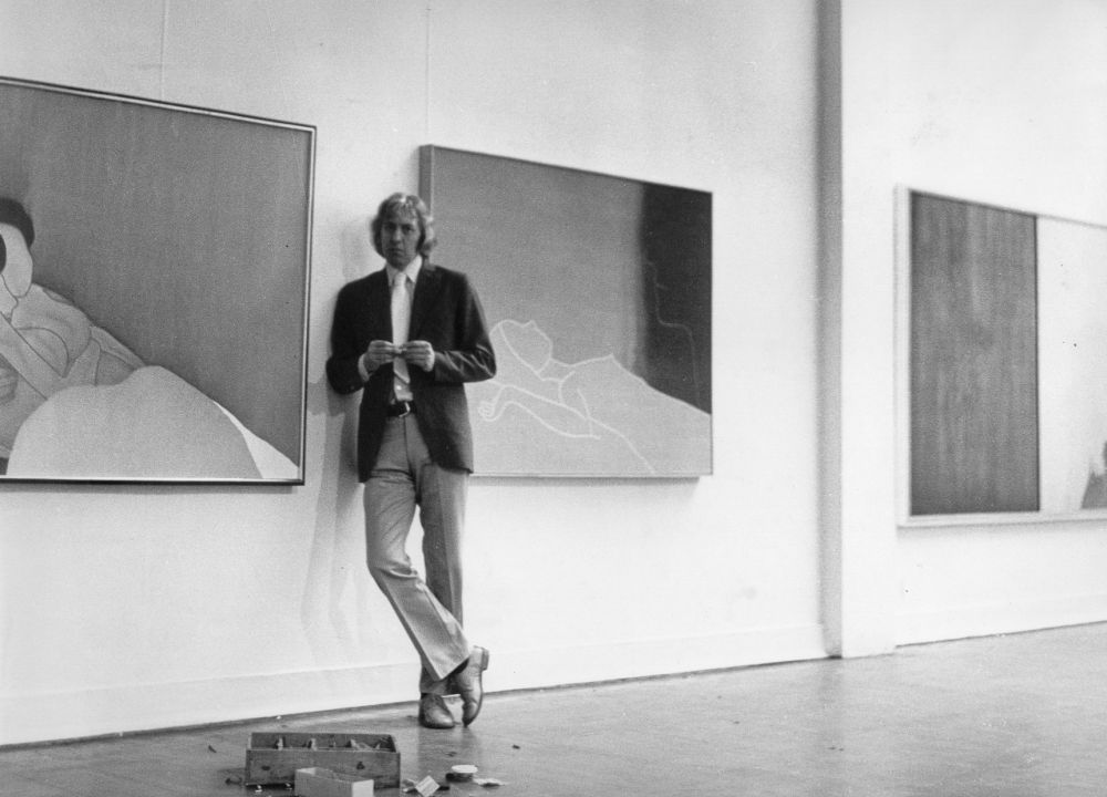
[Derrick Greaves hanging the Whitechapel exhibition]
An appreciation of the classicism of Greaves's work was pursued to different ends just two years later in a review by his long time champion, Pierre Rouve. Writing of Greaves's simultaneous exhibitions at the I.C.A. and at Ewan Phillips Gallery, Rouve perceived 'a controlled radiance that can best be described as classical'.
In contrast to his Zwemmer exhibitions at the beginning of the decade, Greaves ended the 1960s with praise ringing in his ears. One champion was the most important museum director of the day, Bryan Robertson, who through his exhibitions at the Whitechapel in the late 1950s and 1960s - among them Jackson Pollock, Robert Rauschenberg, and Mark Rothko - did as much as anyone to internationalise British art. Responding to Greaves's London shows in 1969, he wrote of the need for a large exhibition of Greaves, prefiguring such an exhibition at the Whitechapel Art Gallery in 1973.
Implicitly illustrating how far Greaves had moved from the 'cosmic unease' that Alan Bowness had previously identified in his work of the early 1960s, Bryan Robertson now wrote of the 'absolute command' of a confident painter in control of his idiom.
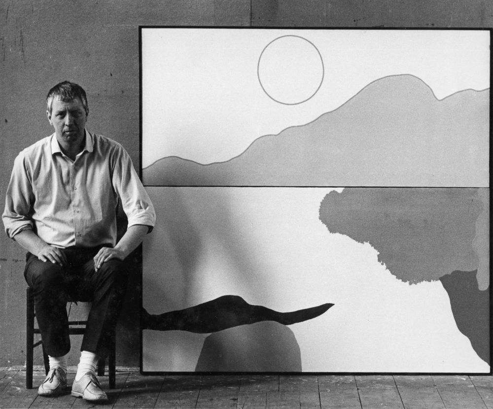
Greaves had succeeded in rejuvenating his work, pulling it apart and reconstructing its vocabulary and syntax, and the late 1960s and early 1970s would witness some of his most powerful works. Flatness was a key, as Greaves himself recognised: At a certain time in my life - and I remember it well - the world as I saw it flattened for me. Things, objects became flat. That is, they had a certain controlled depth. It was not Cézanne's flatness, neither was it Cubism, 'hermetic' or 'synthetic'. It was mine - I hadn't looked for it - how could you? - but it was mine. It did concern the identity of the object but the 'interval' - the intervening space, invaded, and to a certain extent, annexed the objects. Similarly the object pressurised its environment. Edges became crucial. Outline became crucial, ambiguous and then an end in itself. Line emerged as form.He had also continued to paint big, continued to present his imagery in an accessible way and continued his long-standing desire to communicate with an audience. To this he added a new, more economical approach to colour derived from his appreciation of Léger, as he explained in an undated note on the artist:Whatever is there is positive and extreme. A red is a red - black is black. An area is proportionately calculated. A line is a line. Even background is background (realised as positive support). All the ingredients can be plainly seen and each judged as the painter has agonizingly judged them, adjusted them, sometimes eradicated them, then put them back again in a new-found way etc. And yet, from all this classical listing the 'message' - the overall feeling and spirit of the picture - the thing that is not shown - indeed that can only be shown by such calculation and careful adjustment - is the invisible ingredient which rules all the decisions made.
The heraldic quality that critics had already identified in paintings of the early 1960s now came to the fore, as in a number of paintings of a rose and secateurs such as Triptych - Rose with Secateurs (1967) and Secateur and Briar (1967-9). Greaves's very skill as a sign writer and desire to communicate were well suited to Pop Art's demand for immediacy. Furthermore, the graphic style of Greaves's paintings of the later 1960s and early 1970s paralleled the presentation of many Pop artists and possessed particular affinities with contemporaneous paintings by Patrick Caulfield. Indeed, the apparent confidence of these works suggest that had Greaves not established his reputation at such a young age he might have emerged just a few years later as a powerful contributor to Pop Art. Certainly such a fate was enjoyed by Joe Tilson, a contemporary realist of the 1950s who, without such deep branding, did succeed in freeing himself from that decade to re-emerge as a major figure in British Pop Art of the mid 1960s. In contrast, the fame that Greaves gained in the mid 1950s through his promotion as a 'Kitchen-Sink' painter would be hard to shake off.
Greaves's work, like that of Patrick Caulfield, was always highly individual and highly sophisticated, making any characterisation as a Pop Artist as misleading as it is revealing. But there are striking affinities. Greaves went from sign writing to painting and Caulfield from graphic design to painting, while both spent the mid and late 1950s producing thickly worked social realist paintings before developing signature styles in which a graphic boldness was married to an heraldic quality. Both conceived of painting as a sign and the object as an emblem. Both individualised their objects and drew from the lessons of Synthetic Cubism, Caulfield from Juan Gris and Greaves from Georges Braque, and at times both drew from the semiotic playfulness of René Magritte.
Individualism, playfulness and semiotic complexity are all to the fore in a highly finished drawing of 1969 that encapsulates the way that Greaves had reformulated his visual language. A manifesto picture, The Pleasures of Drawing (1969) is the most finished of a series of works showing an easel with a picture on it and can be read as a surrogate self portrait. The easel stands in for the artist and a bird in flight represents painting as an act of liberation.
The Pleasures of Drawing also plays games. It plays formal games with the parameters of the picture and the transparency of forms, but also games with what is real and what is imagined. Is what is represented a bird that flies past or is it a picture of a bird? The conceit is shared with Magritte's paintings of a canvas before a window and Braque's atelier paintings, with their interpenetrating forms and leitmotif of a bird in flight. Yet in its linear emphasis the work also exemplifies the concerns of Derrick Greaves. For, whether drawing or painting, Greaves places a strong emphasis on the animation of line, pictorial flatness and visual wit.
As Greaves restructured his compositions, he wrestled with how to include the subject without being too illustrational and how to pare it down without becoming completely abstract. He considered how a painting might be attention-grabbing like the boldest sign, yet still keep one engaged like the most sophisticated painting - offering enough, but not too much.
It was not just drawing that changed, so too did the colour. Although there are works in which subtle silvers and greys set off the form, there was also a heightening of the colour and a new boldness that suggests another influence: Vincent van Gogh. In 1967 Greaves went to Provence in southern France with the photographer, Dave Mindlin: 'as a result of my suggestion that every decade or so, I felt I re-understood van Gogh It was very odd coming to it through my own work'. The result was a series of drawings such as a large drawing, The Sower (1967-8), some ambitiously composed paintings such as Diptych - A Window in Arles (c.1968) and a portfolio of big screenprints:Along with the celebratory character of van Gogh's Provence work, which was more highly chromatic than before, I saw him as a kind of self victim van Gogh's work was about high chroma but also hysteria, and my own work was somewhat critical of that. The suffering that he went through was something that I didn't share, that self martyrdom. I'm more detached and intellectually removed than that. But I did a lot of drawings around that theme so it must have had a significance that was heavy enough for me to go on doing it.
A cluster of exhibitions in the early 1970s - at La Citta Gallery in Italy and, in London, at Basil Jacobs, Ewan Phillips and the Whitechapel Art Gallery - showcased Greaves's latest achievements. Praising Greaves as 'a formidably gifted artist who is modern, contemporary, strikingly individual ... a master of line and colour', Marina Vaizey recognised that:
for all Greaves's apparent austerity - his economy, his discipline, his precision - the effect is rich and resonant, a Western rendering of the virtues of Oriental art ... He abstracts from the particular, a single vase, a flower, the outline of the human form, the line of the horizon, to produce images which stand for all flowers, all peoples, all horizons He is obviously one of the most interesting artists at work in Britain, and his work is memorable, distinctive and movingly beautiful.
The following year this success was confirmed by a solo show that was presented in Belfast and then Dublin, attracting superlative reviews. The Irish Herald declared the exhibition to be 'one of the most important exhibitions by a modern painter seen in Dublin for some time' and the Irish Times wrote of 'someone you simply can not walk away from. He changes your consciousness, becomes a part of one's private mythology'.
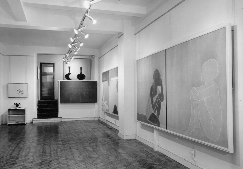
[Installation at Basil Jacobs]
The use of diptychs and triptychs in paintings of the later 1960s and early 1970s allowed him to suggest time, hinting at the passage of time between one image and the next, or to combine incidents in different times and places brought together for contemplation. In paintings such as Triptych - Large Grey Still Life (c.1965), Triptych - Red Leaves (c.1965) and Diptych - Veranda (1964-6) - all subsequently destroyed - the effect of this attempt to address a subject from different angles, literally and metaphorically, added a more complex literary or narrative element to the static medium of painting. was a solution that would ultimately prove dissatisfying for the artist and, although many paintings did employ this format, he later rejected the approach to narrative that had been their raison d'etre. He destroyed several of these works. Others he reduced to a single canvas or severely cropped. Their success certainly varied. Sometimes a painting was stronger as a single canvas rather than a diptych and the lessons learnt led to a restructuring of these single canvases. In Praise of the Right Angle (1973), for example, began as a single large horizontal painting that was effectively a diptych in conception. On the right was a vase with the overlapping form of a flower on a stalk, coming in at a right angle, and on the left is the same vase and filling it is the same flower, no longer attached to a stalk. However, Greaves subsequently felt that this two-part painting was too obvious, cutting it in half and keeping the left hand part as an independent painting.
This radical process of cropping individual canvases and splitting up diptychs and triptychs lessened the literary quality of these paintings, returning them to the realm of pictorial imagination and, despite their clarity of form, reinforcing their allusiveness. Greaves recently wrote:Editing for me is always there as a decisive part of the process in the studio. The omnipresent anxiety or discontent that I feel as I work is often quickly focused by a casual glance towards canvases that have been set aside for whatever reason. Urgent surgery suggests that by compositional change or cutting the canvas size pictorial life could perhaps be saved by such previously unpremeditated action. Sometimes it works - at least to keep the discontent at a distance. In the end one knows that a bonfire can always 'draw the final line'.
Greaves's assault on his own work led to regrettable losses as well as undoubted improvements. One of the greatest losses is the large triptych, Triptych - Bedroom (1966-7), which was clearly one of Greaves's most significant paintings of the 1960s and was illustrated along with work by Patrick Caulfield in London Magazine in 1967. It shows three elements - a woman's legs and stilettos, two flowers and a bedside mirror - presented side by side to provide a clear, well-structured composite view of a bedroom.
Meanwhile, Shadow of a Bird on a Road (1971) was originally a diptych that consisted of one canvas showing the shadow of a bird and a second, almost empty, canvas that created an enlarged sense of space. However, Greaves rejected this emptier canvas. The resulting single canvas is one of Greaves's most beautiful paintings of the period, one whose origins as a diptych perhaps explains the daring composition in which the bird is displaced to one side, a device that gives the painting its great strength. limpid fluency of Shadow of a Bird on a Road was facilitated by the wateriness of thinned down acrylic, which allowed him to paint 'watercolours' of huge magnitude, perhaps inspired not just by English landscape watercolours but also by the paintings of Helen Frankenthaler, which he admired. Despite the echoes of Braque's birds, the subject was observed on a journey by car from Italy and Switzerland, journeying through the Valle d'Aosta. The sun was high and Greaves noted in a sketchbook: 'everything crystal, what strange luminosities the mountains'.
Related works share these qualities. The drawings Bird and Vase (1971) are concerned with movement and stasis and also with presence and absence. Are we shown a vase and a bird as the title suggests, or merely their shadows? For all the monumentality, what is depicted is a shadow rather than the bird itself and this encourages us to read the lipped vase as similarly lacking in substance. Complicating this is the relative substantiality of the charcoal ground, which has been so worked and scratched into that it has a greater materiality than the things depicted. Braque's bird had been let loose from the confining atelier, its flattened form well illustrating Greaves's rejection of modelling and the illusionistic creation of volume and weight. This would pave the way for the linearity and lightness of his later work with its interpenetration of forms and use of transparency. Meanwhile, the nocturnal painting Shadows (1971) combines these two motifs on a single canvas, in which the vase is as flattened and animate as the bird and tilts drunkenly, perhaps the result of Greaves's use of an epidiascope, which he had begun to use in the late 1960s, to project the source drawing at an angle. Here, as in many other works, a shadow has the substantiality of an object.
As Caroline Tisdall recognised in her review of the Whitechapel show: There's a predilection for the moment when things in nature change from one state to another; the gust of wind, the shadow of a bird cast on a road, a petal falling. Then there's the range of subjects where the ambiguity is more overt: woman with spider, Pandora, a nervous girl, touches of lesbianism and sleeping figures. All this and Greaves's carefully graphic lines give his work a hint of nostalgia for classicism.
Greaves also revealed a new clarity to his portraiture that is especially evident in a portrait of his friend Prunella Clough. Greaves's painting, By the Sea (Portrait of Prunella Clough) (1972) is a large-scale portrait of the artist inspired by the car journeys that she would take to watch storms over the sea and suggests both the enclosure of a car and the horizonless expanse of sea blurring into sky.
The Whitechapel exhibition also demonstrated a new complexity to Greaves's compositions in which the interstices took on a new prominence. Experimenting with combining canvases, either placed directly together or using the structuring formats of triptych or diptych, allowed Greaves to combine motifs, upset the chromatic scale and draw new attention to the space between figures, objects and settings.
The diptych In the Garden (1971) is one of Greaves's most successful paintings. If there is a narrative then it is implied, not stated, alluded to rather than explained. But there is no obfuscation, just clarity. On the left an apple tree sapling spikily extends from bottom to top in contrast to the curvaceous figure in the right hand panel. The subject is reduced to essentials - a twig, a single figure - yet despite the economy, the effect is rich.
Meanwhile, The Jungle (1970) is a triptych in conception if not actuality. One of Greaves's most powerful large-scale paintings and one that anticipates his later development, The Jungle combines three separate elements into an harmonious whole. In place of overlapping forms Greaves now separates them out, allowing each its own autonomy rather than literally imposing a setting onto the figures. This clarity and the distinctiveness of each form would become leitmotifs of the paintings that followed. In them Greaves would objectify his subjects, more and more, to democratically suggest an equivalent importance to each element. In developing his imagery in this way, Greaves gives grandeur to his exploration of sexual dynamics which had recently found expression in his book designs, such as the dust jacket designs for Paul Theroux's novel Girls at Play (c.1969) and Rosemary Tonk's Businessmen as Lovers (c.1969), in which a married businessman places his hand on the leg of a mini-skirted woman. This is taken further still in the post-coital painting A Woman and a Man (1979), in which a woman lies back with a cigarette between her fingers as a man walks away from her. Greaves, too, was moving in new directions. New stimuli would lead to another reformulation of his language.


